A quiet, essential identity for a modern skincare ritual.
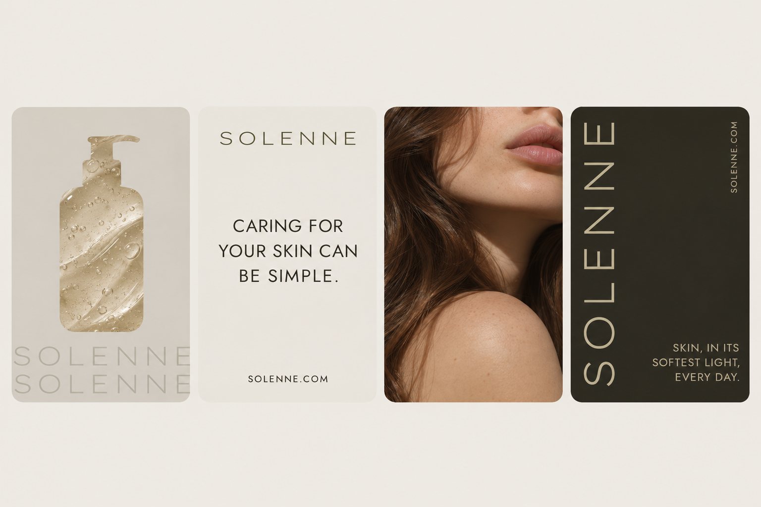
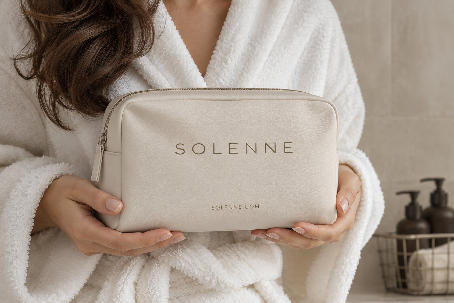
Solenne is a self-initiated brand concept for a minimalist skincare line. The goal: a system calm enough to feel like a deep breath, yet distinctive enough to own the shelf, built from a tracked-out wordmark, an earthy olive-and-sand palette, and soft, natural-light art direction.
Identity
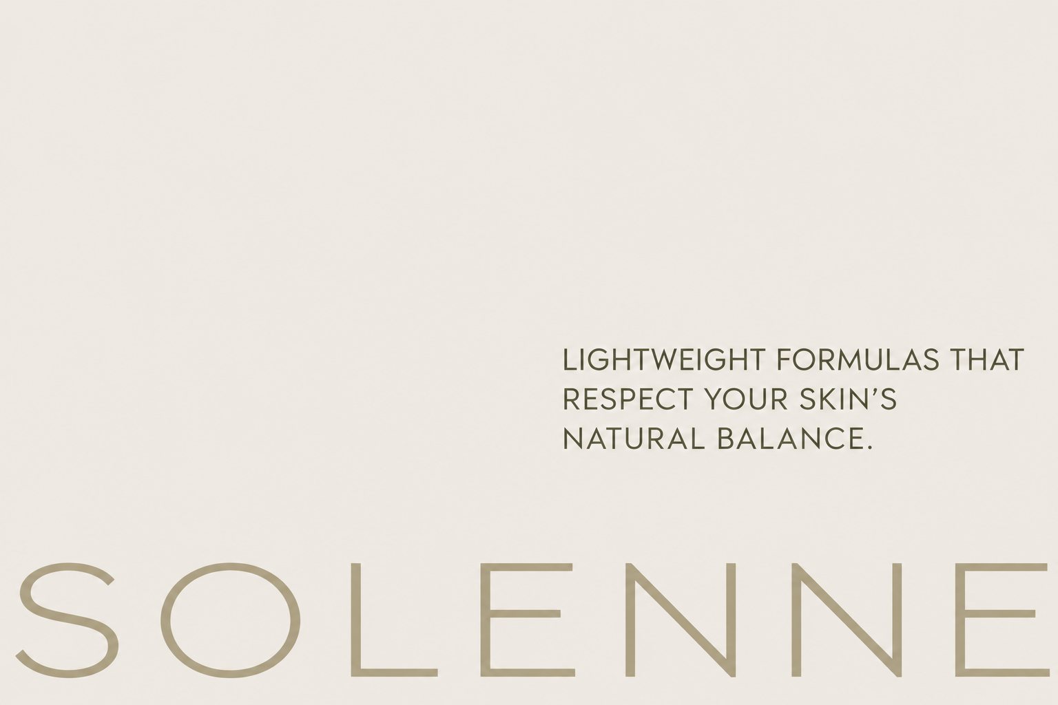
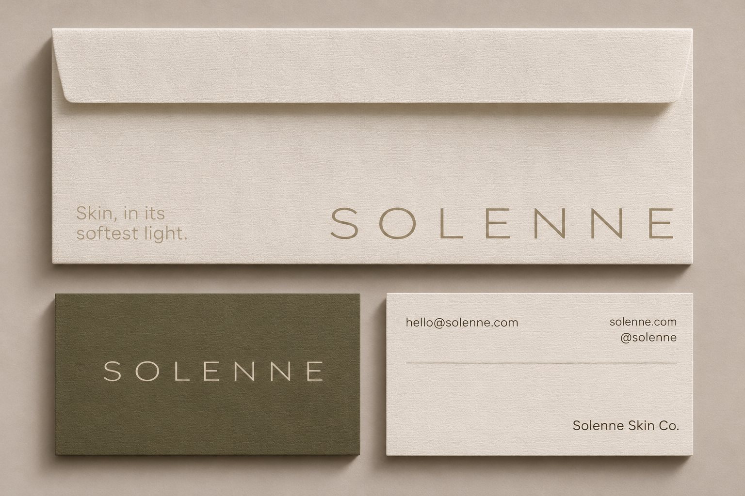
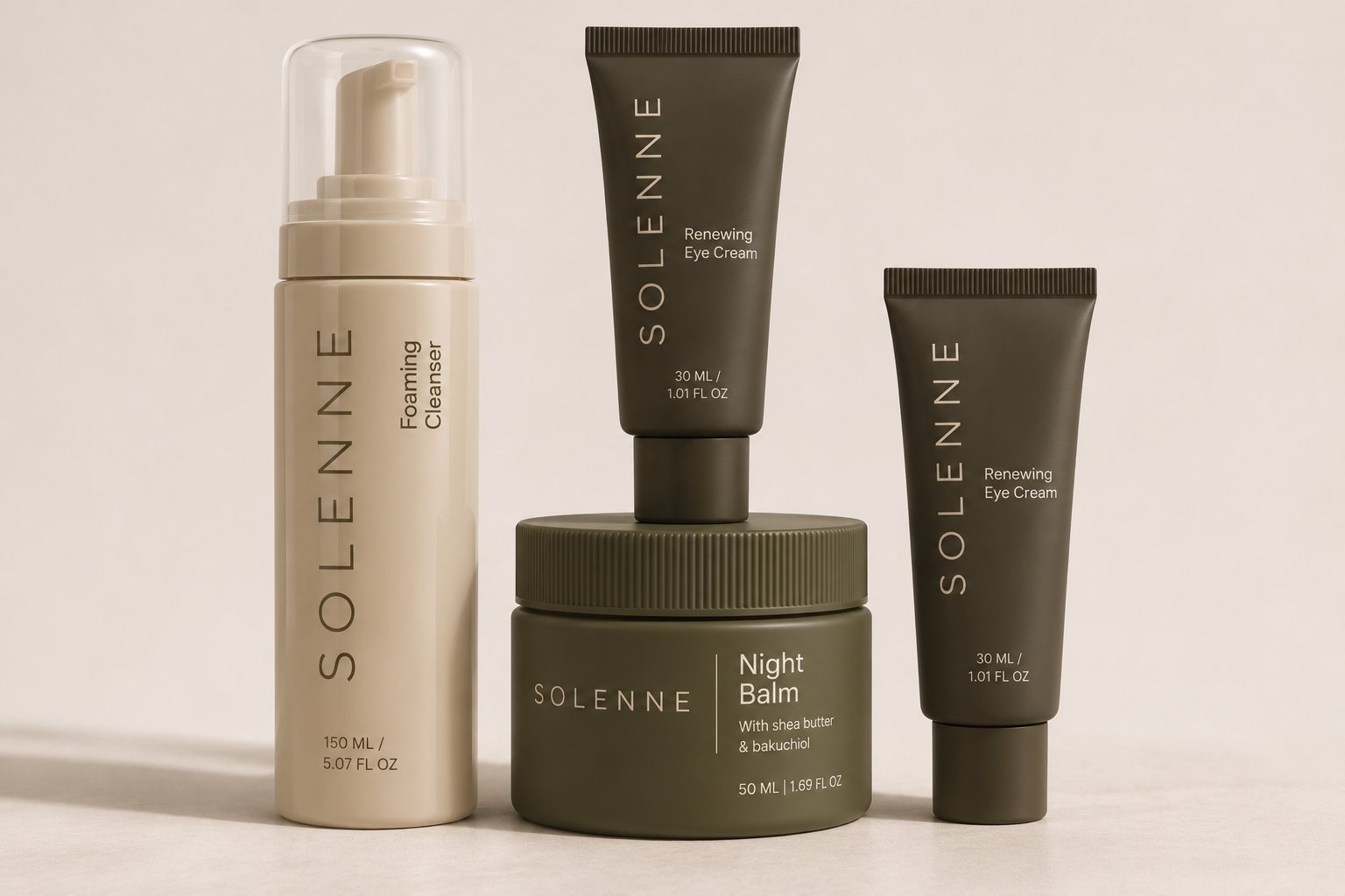
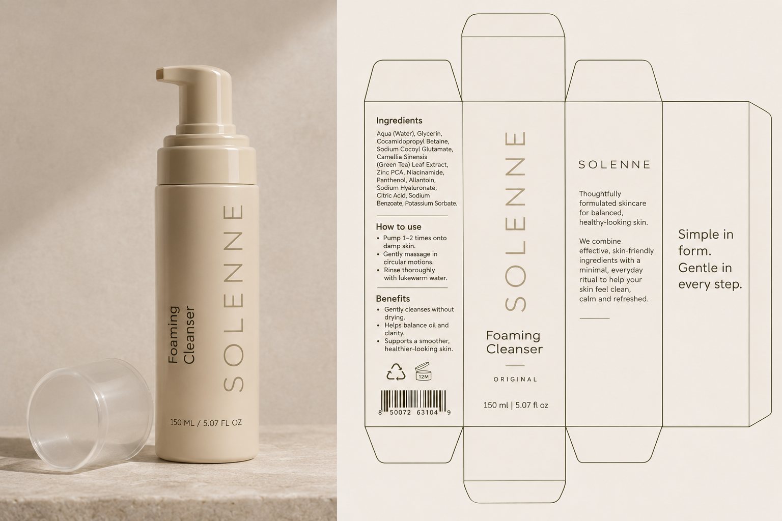
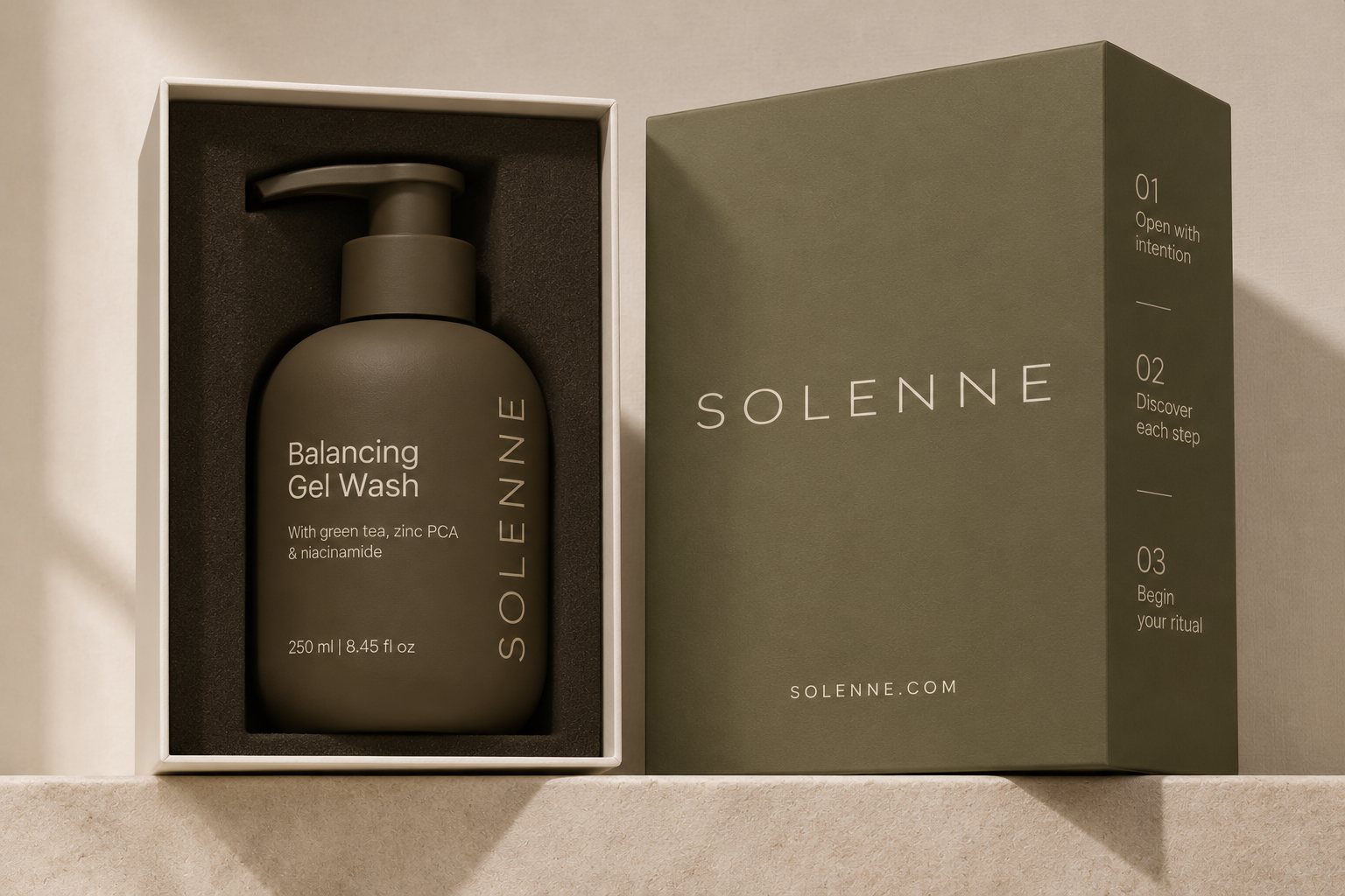
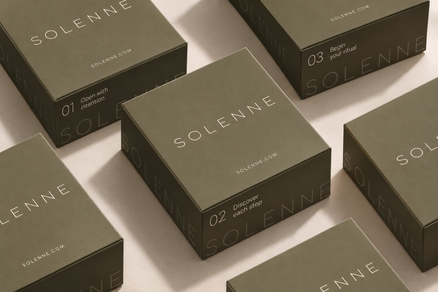
A light geometric logotype with generous tracking does the heavy lifting. It runs horizontally on primary surfaces and rotates vertically on packaging, so the brand reads the same from a billboard to a 30 ml tube.
Packaging
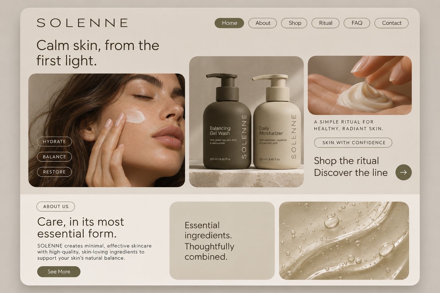
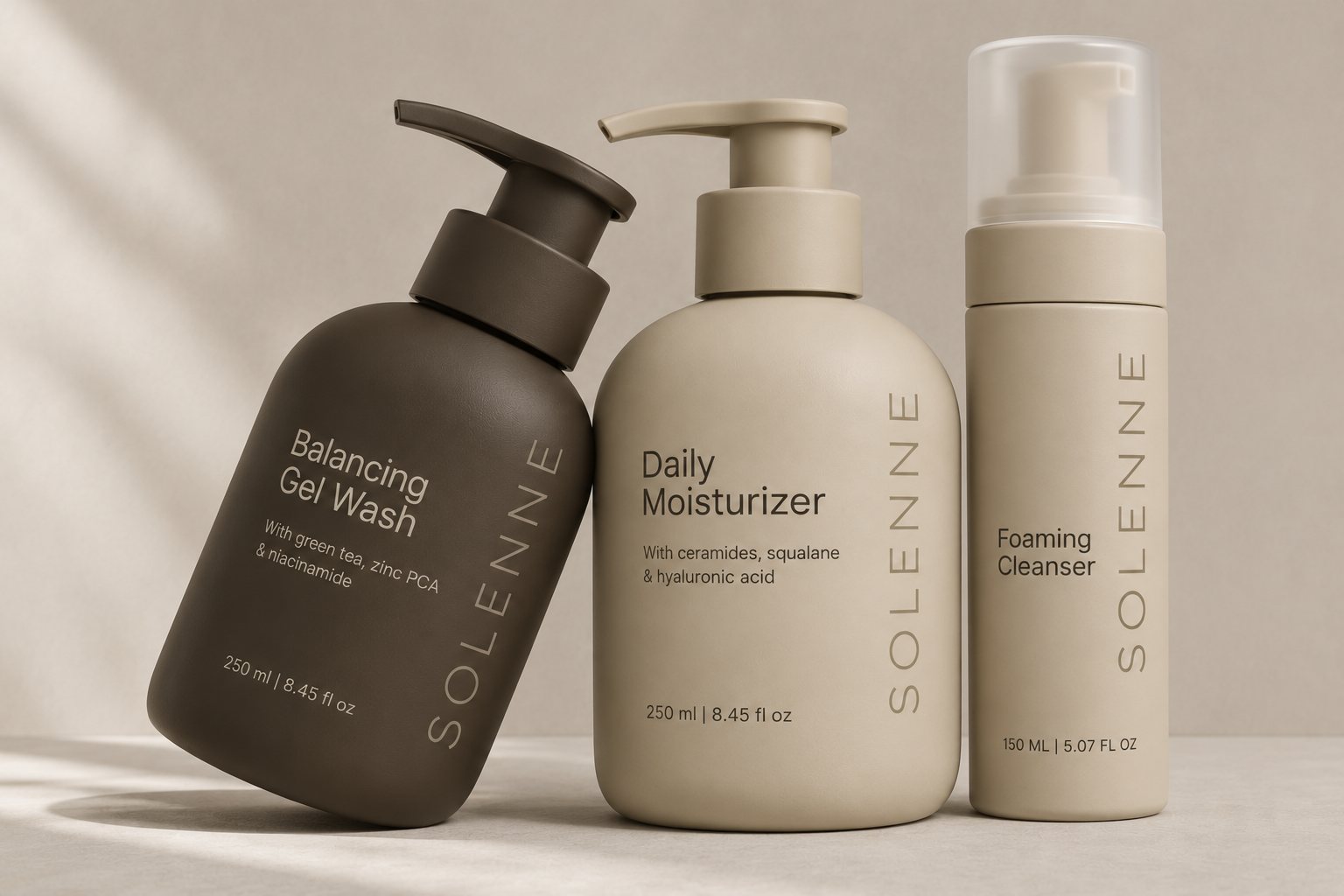
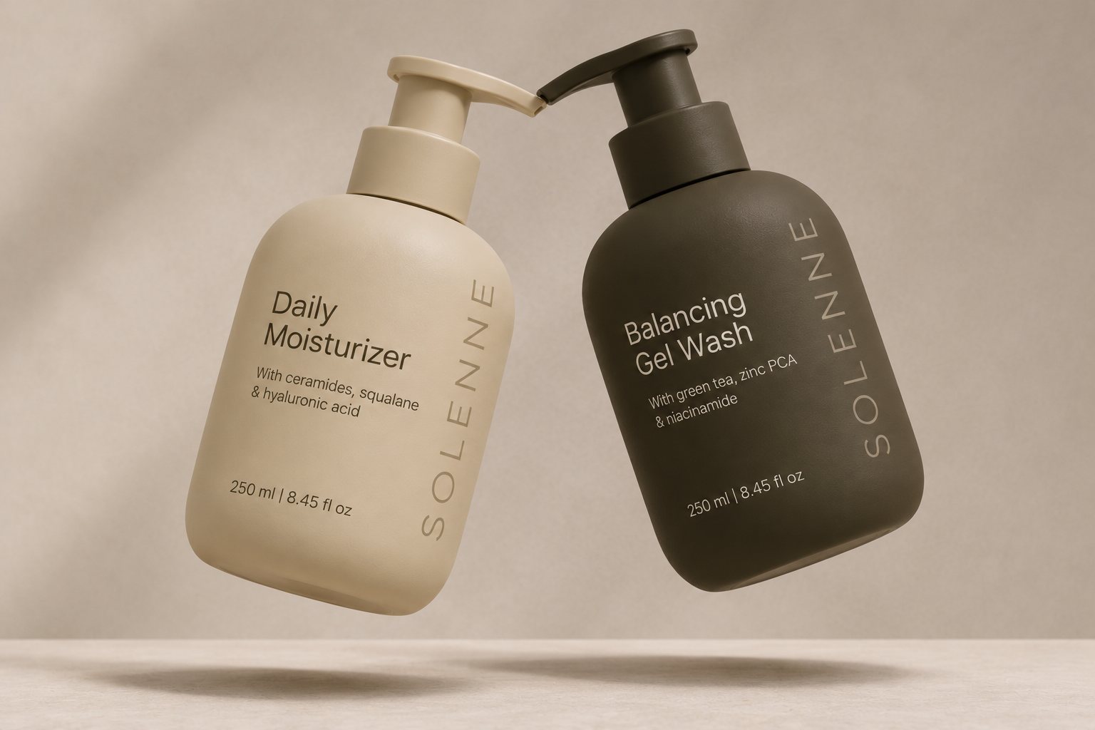
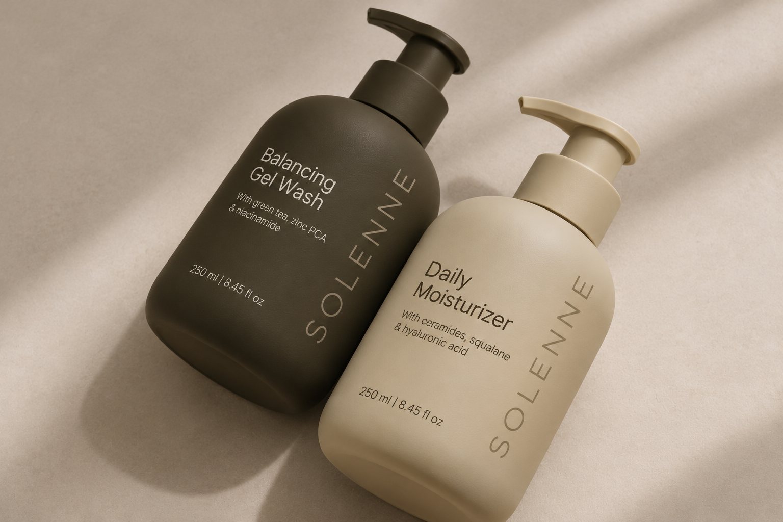
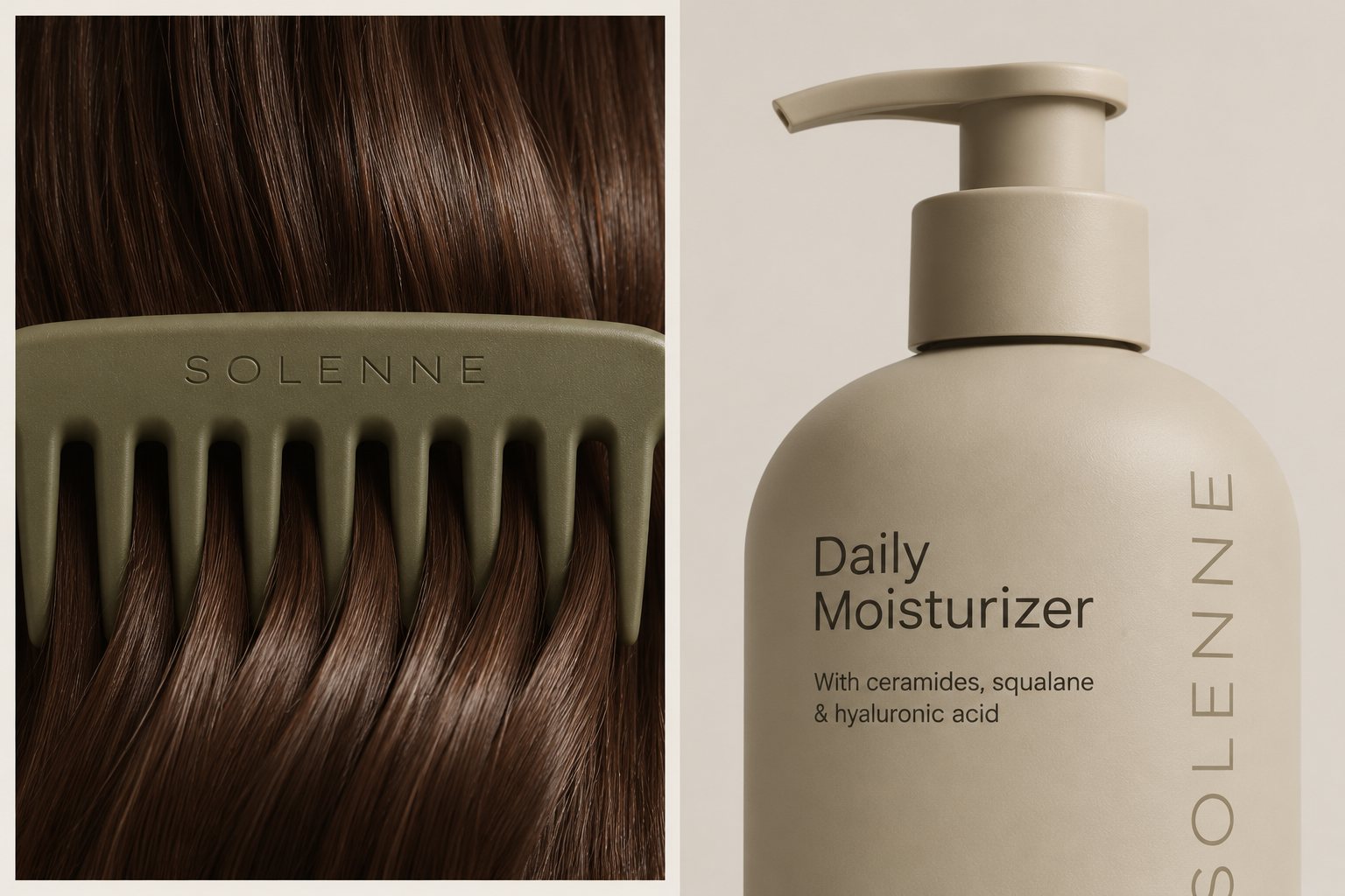
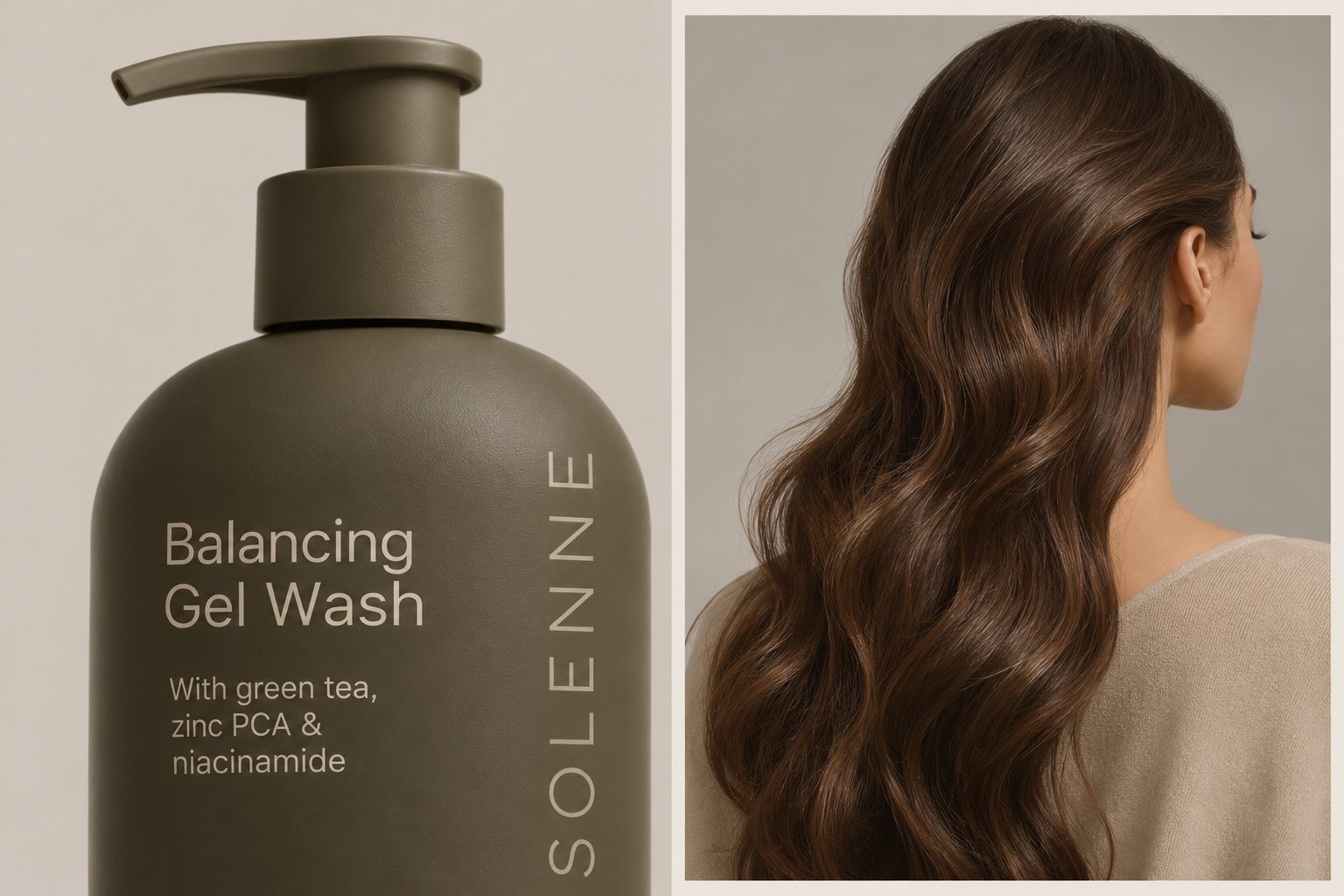
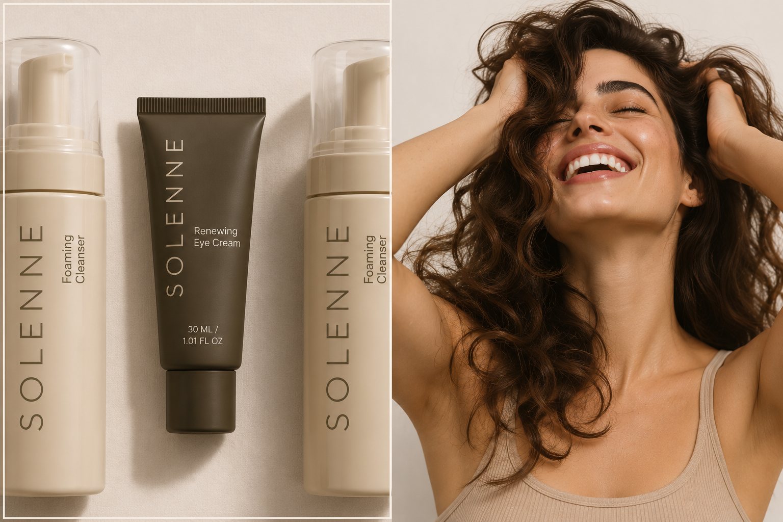
Soft-touch matte bottles in two tones signal the routine at a glance: espresso and olive for cleansing and treatment, sand for hydration. Each label pairs a plain product name with its key actives, with no clutter and no claims.
“Care, in its most essential form.”
Brand lineCampaign
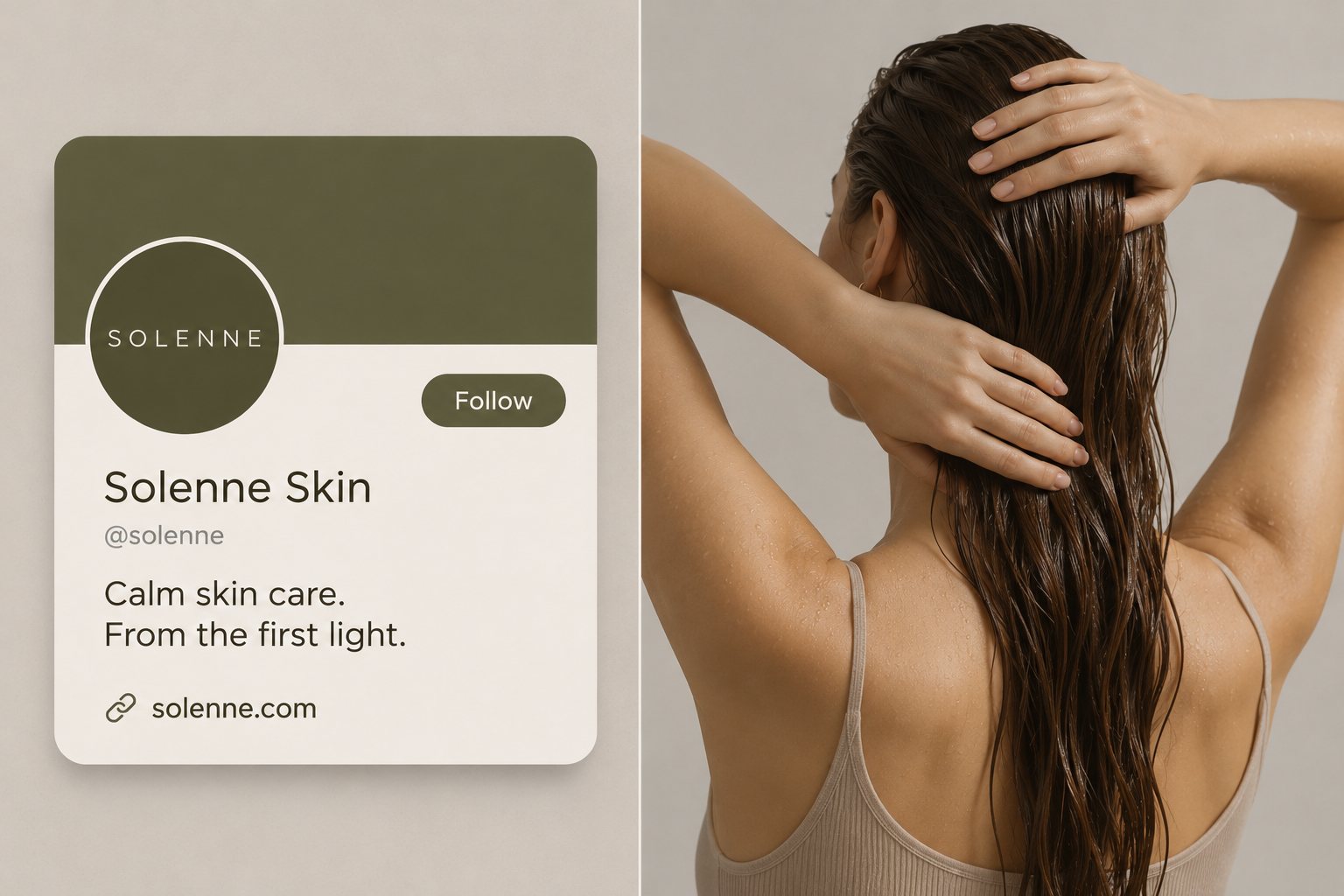
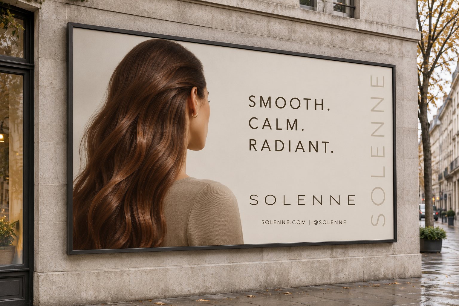
Art direction leans on warm natural light, bare skin and real texture. Short, calm headlines like “Smooth. Calm. Radiant.” carry across out-of-home, print and social with the same restraint as the packaging.

Digital
The website extends the system with soft rounded cards, pill navigation and an editorial grid that lets photography breathe. Social keeps it simple: olive avatar, one-line bio, consistent voice.