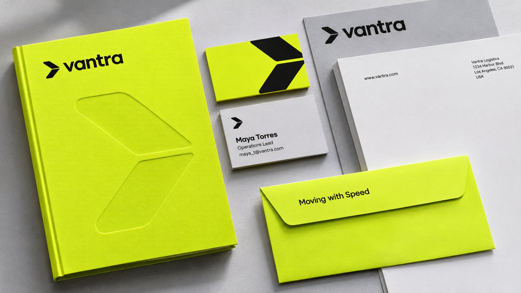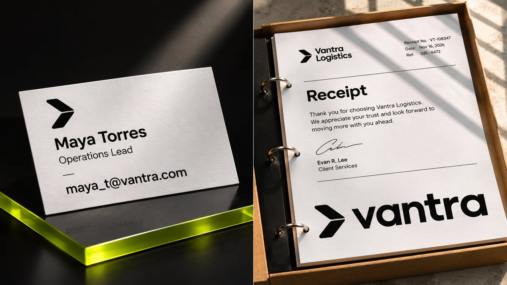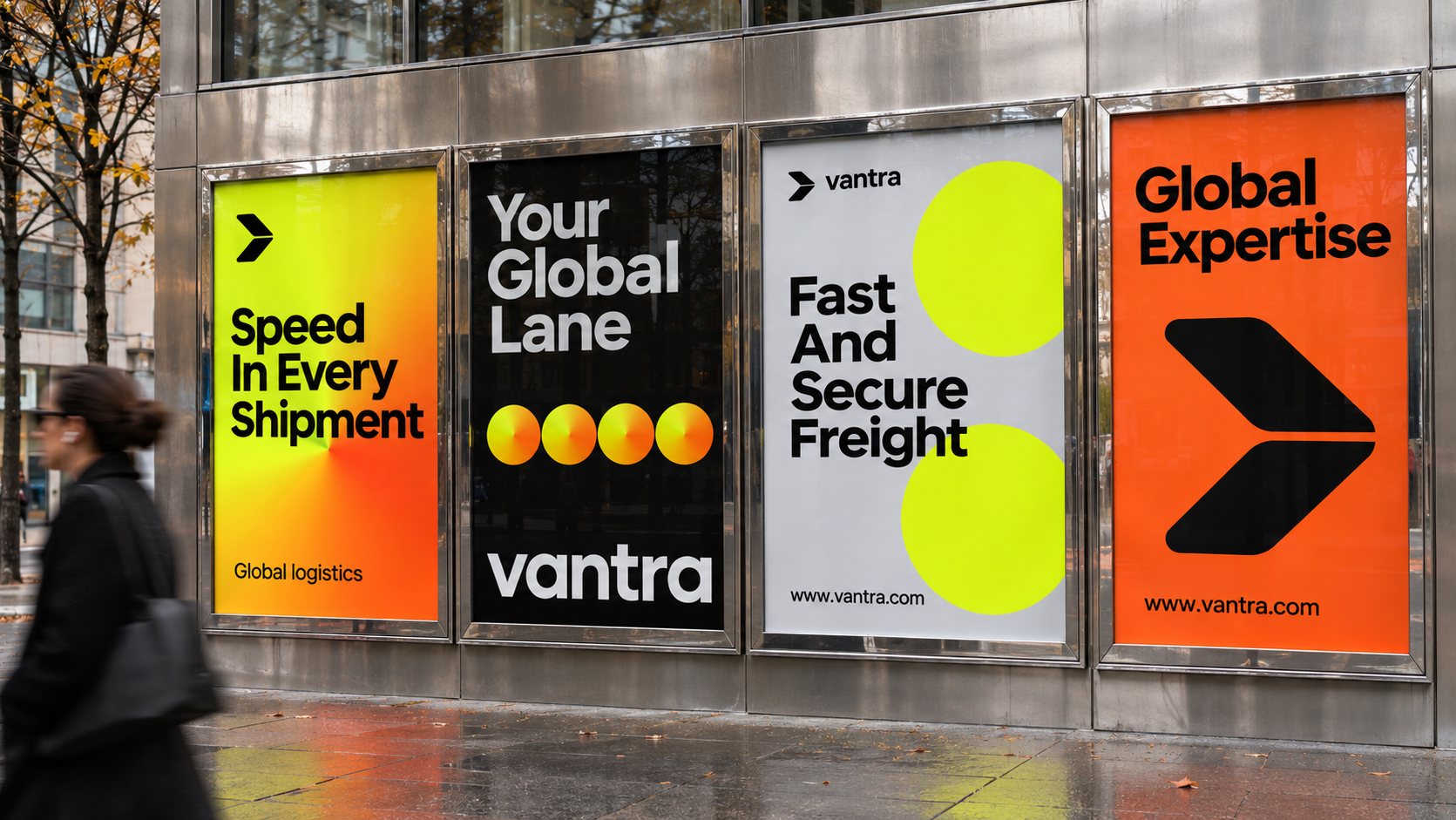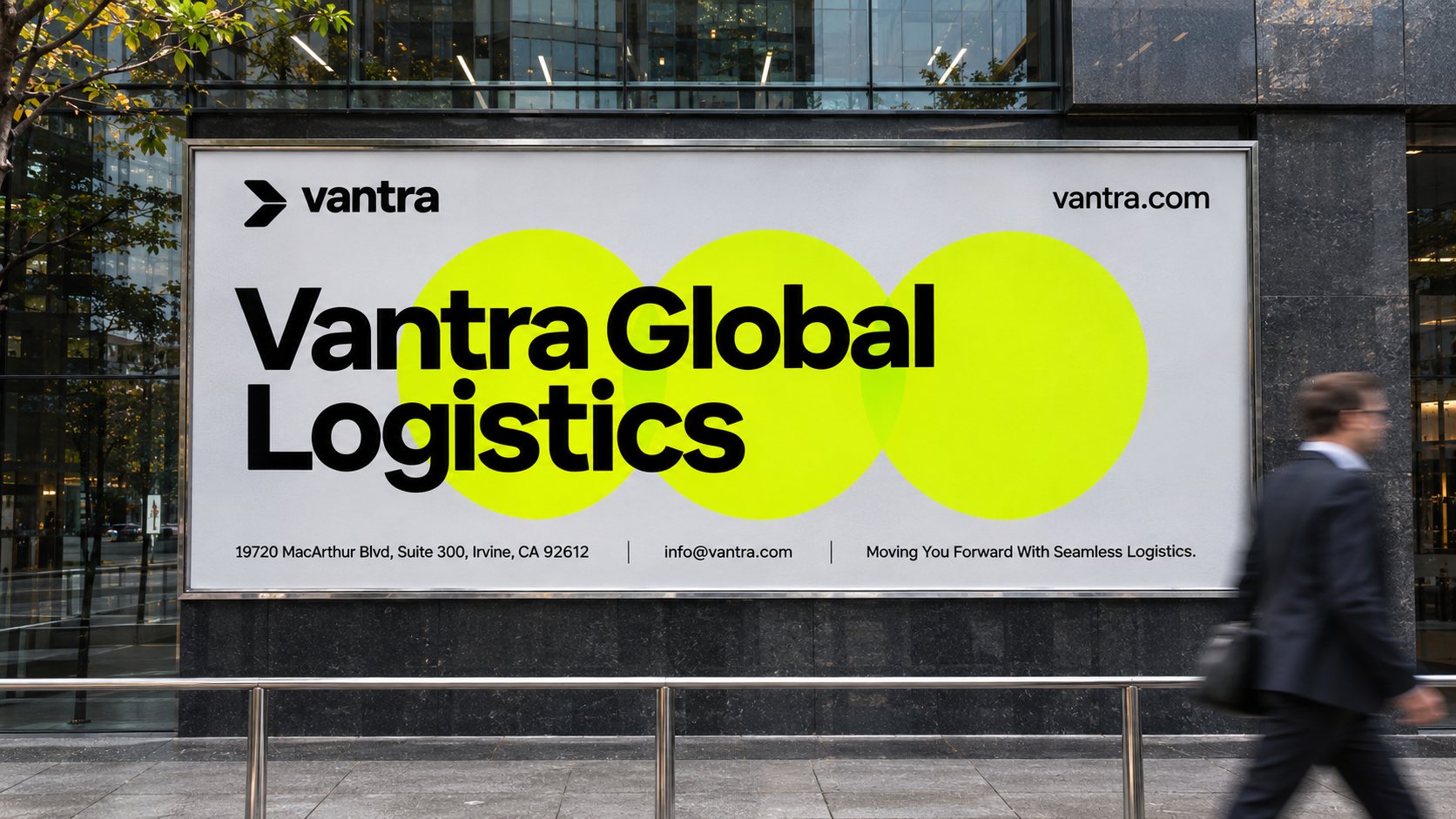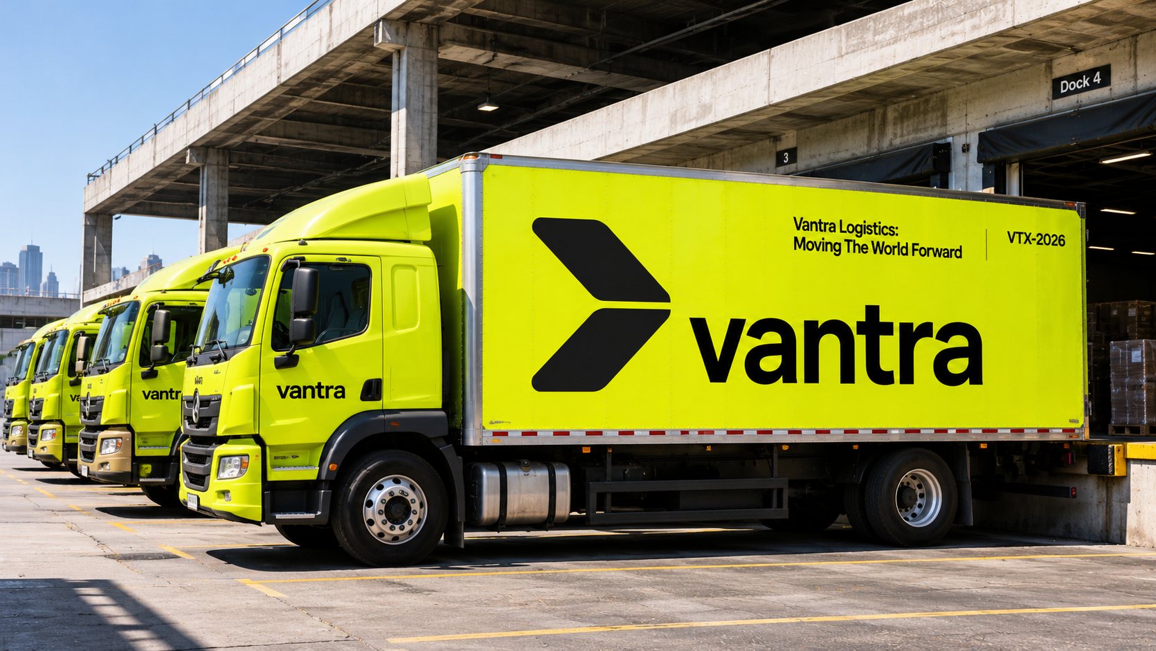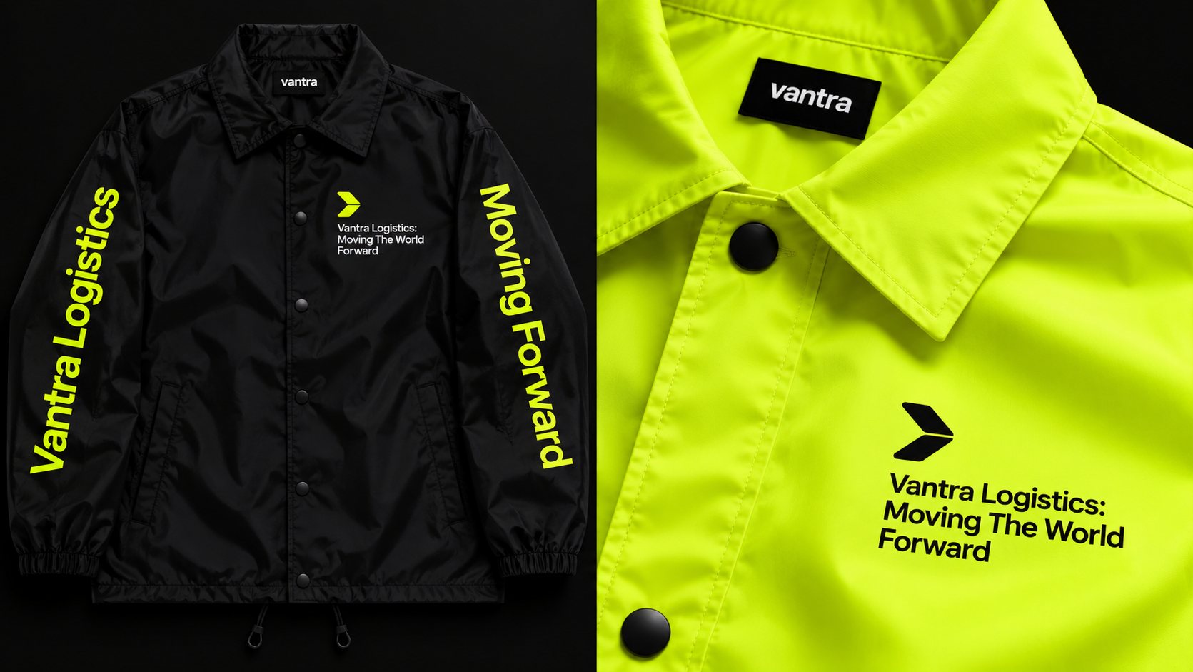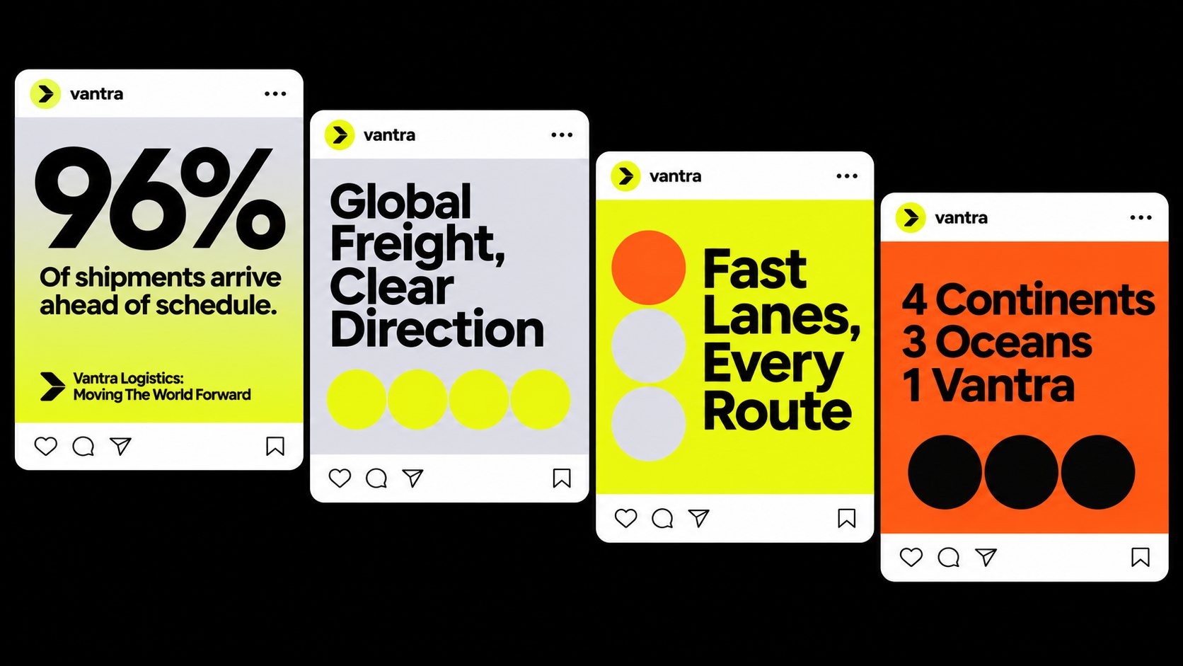
Vantra is a concept identity for a global freight company: a brand built around forward motion, high-visibility color and a custom logo typeface.
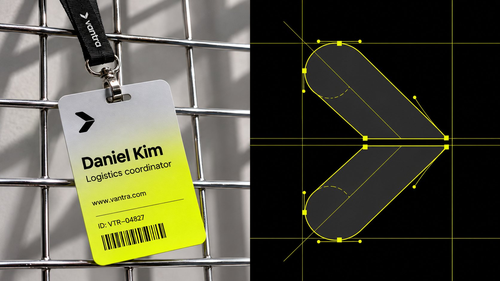
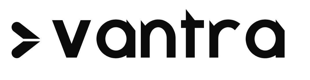
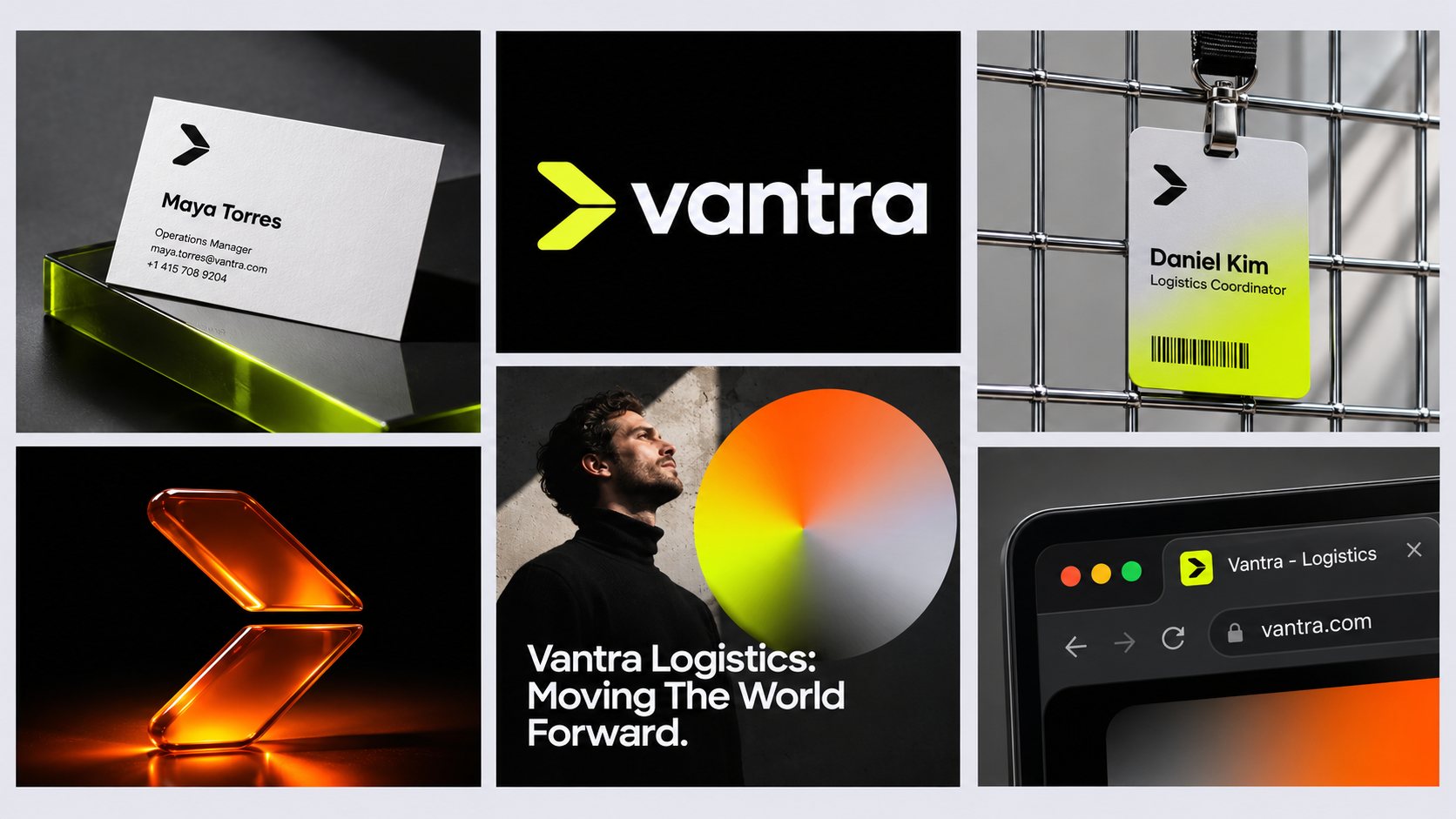
The mark is a split chevron, two pill-shaped strokes with round outer ends that point forward. A thin horizontal gap divides them, a nod to lanes and handoffs, the moment cargo passes from one leg of a journey to the next.
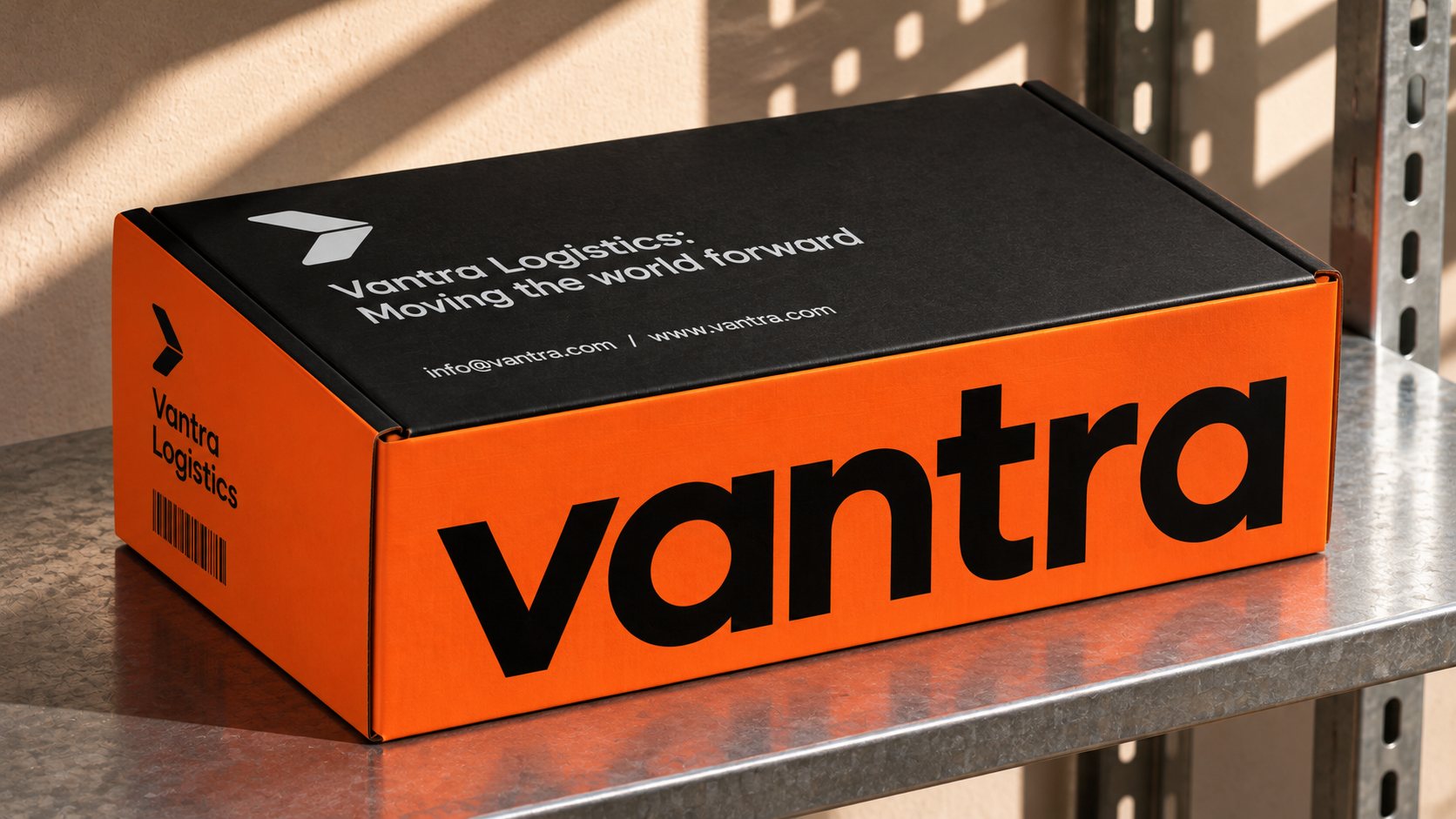
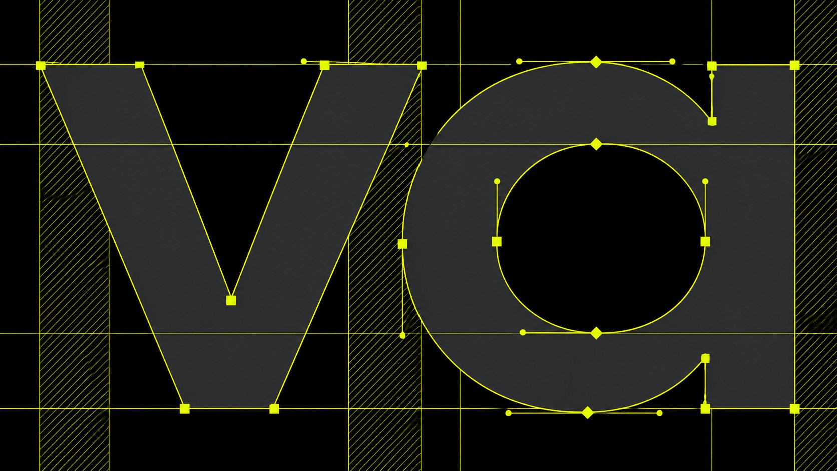
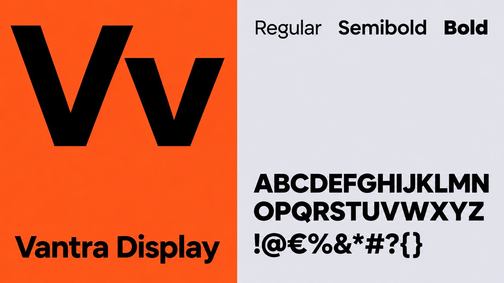
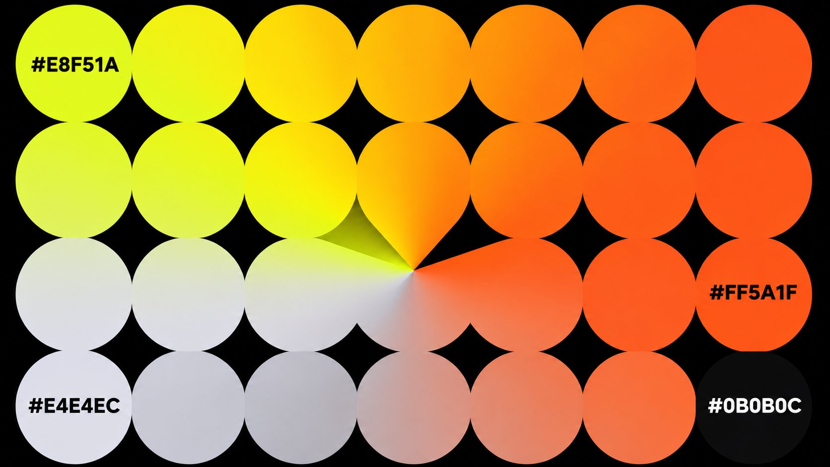
The wordmark is set in Vantra Display, a geometric typeface drawn for the brand. Stem tops are cut on the mark's diagonal, descenders end in the same round cap, and the dots are half-pill leaves taken from the logo. Acid lime and signal orange carry the system, borrowed from the safety colors of the freight yard.
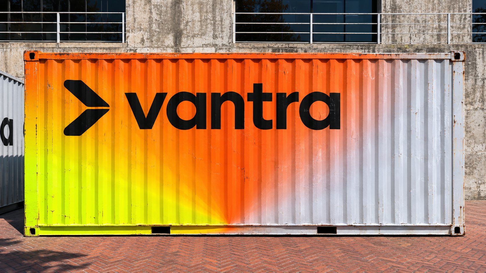
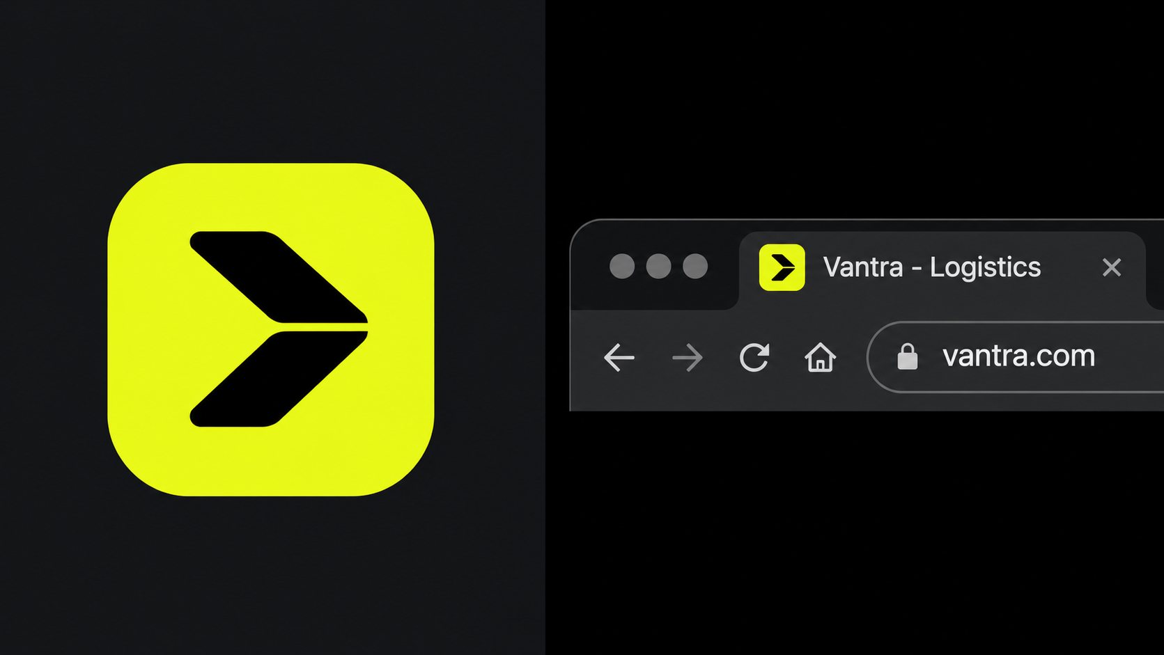
The split chevron and lowercase wordmark work as one lockup, or apart at small sizes and as the app icon.
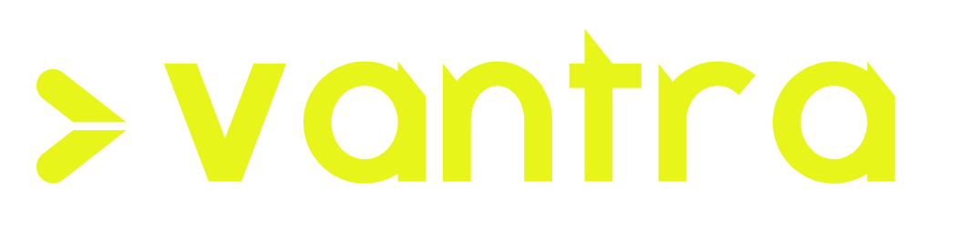


A custom logo typeface. Diagonal-cut stem tops, round pill descenders and true geometric bowls.

High-visibility lime leads; signal orange marks urgency; cool grey and ink keep it calm.
From the freight yard to the feed: stationery, packaging, signage, fleet, apparel and digital.