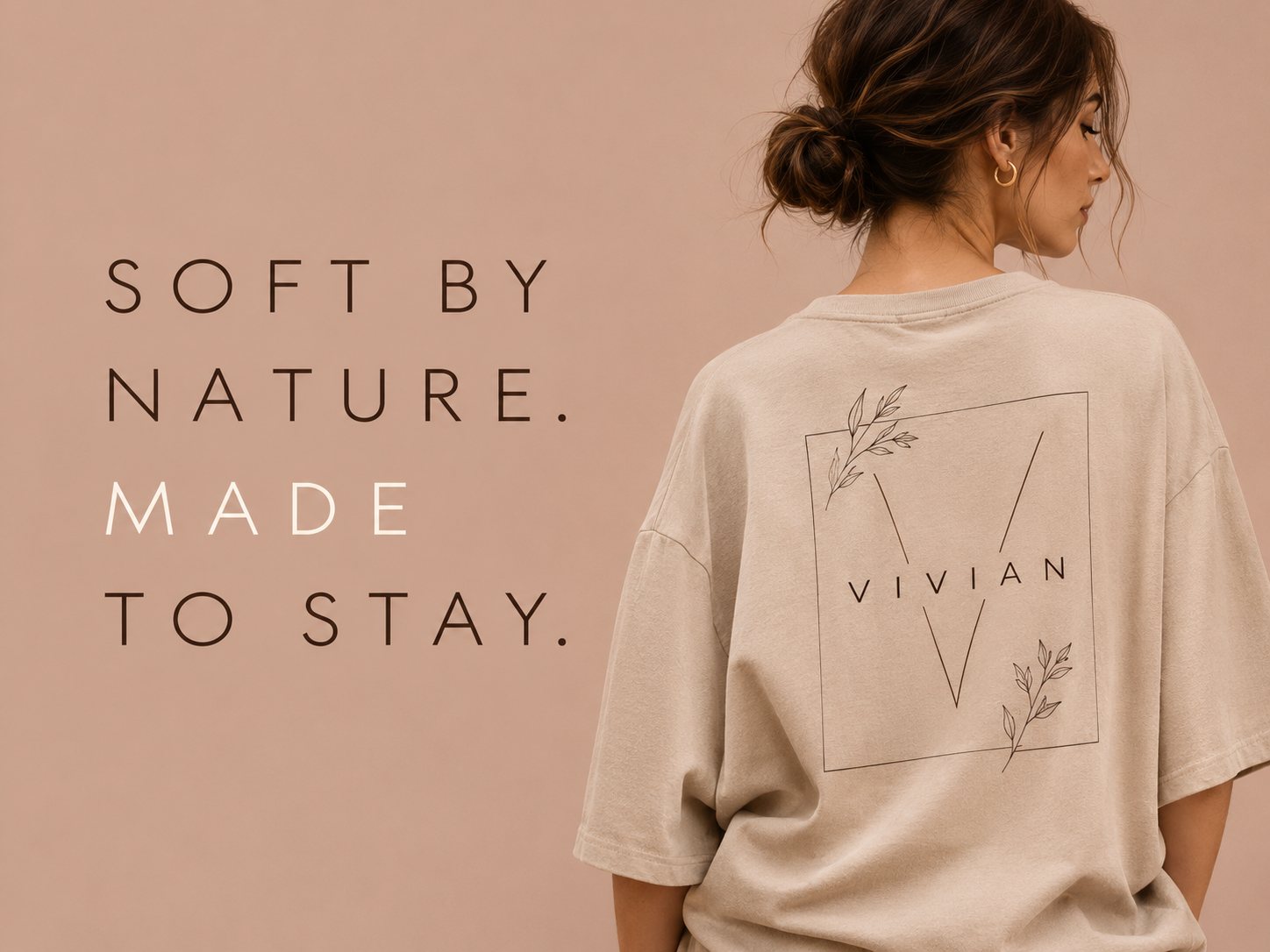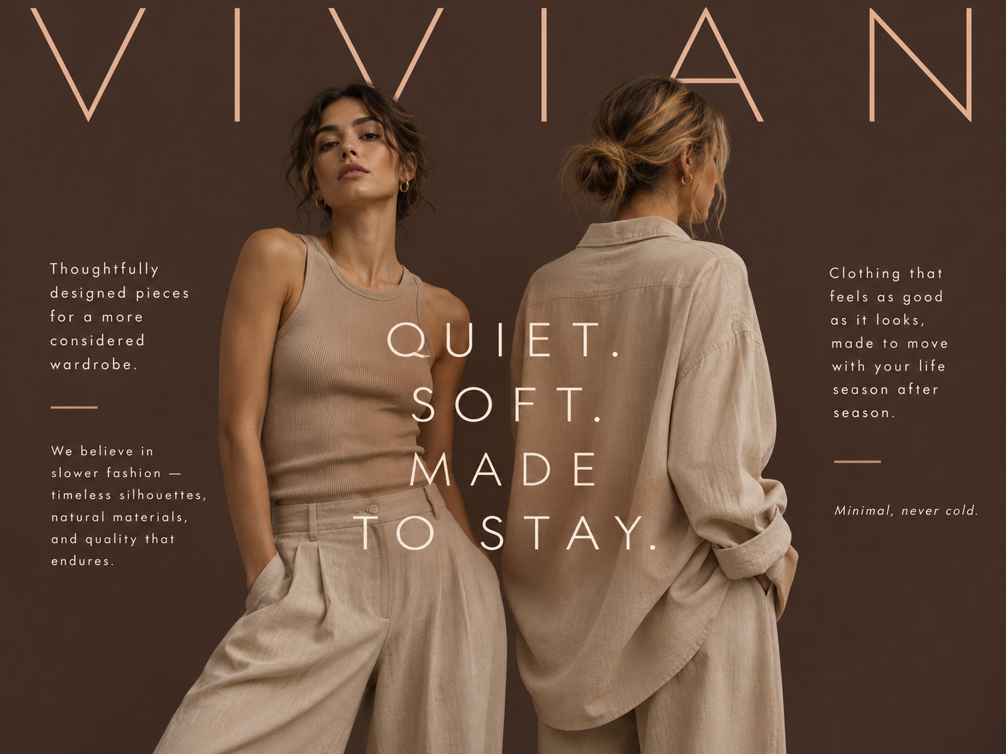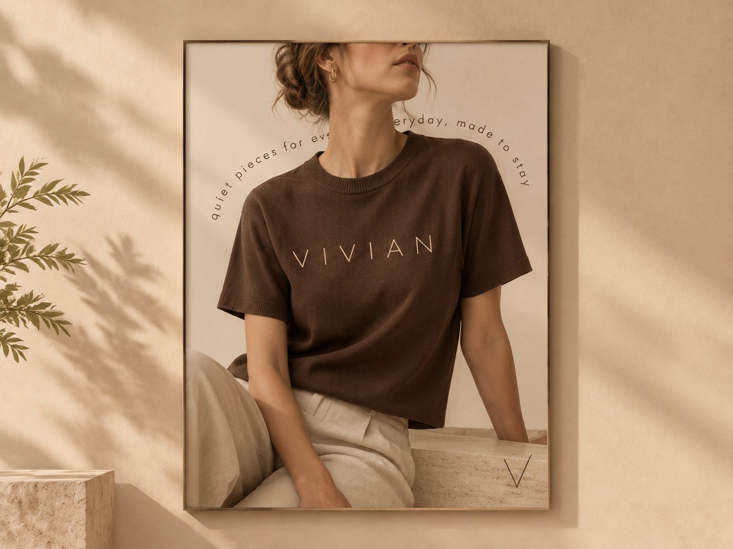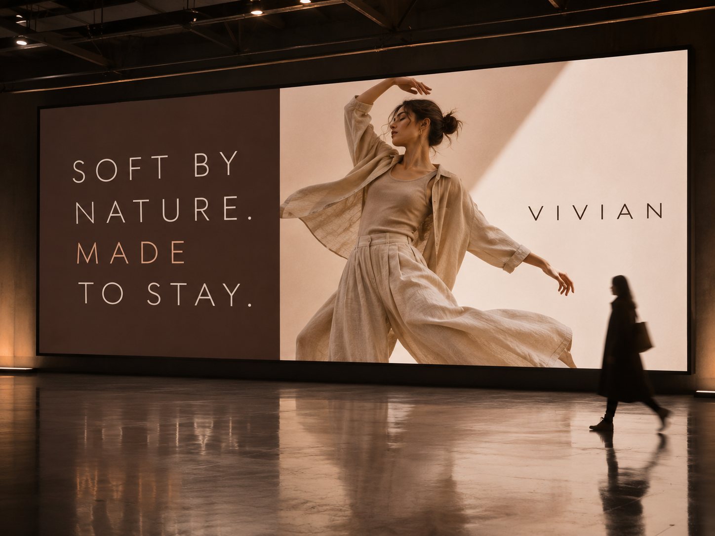
Vivian is a concept identity for an independent womenswear label built on softness, natural fibres and quiet confidence.
The name carries the idea of being alive and at ease: clothes that move with the woman wearing them rather than speaking over her. The identity follows the same idea, calm, tactile and made to last, as considered as the garments themselves.
Minimal fashion is crowded with cold, clinical branding: stark white, hard black and very little feeling. Vivian needed the restraint of minimalism with the warmth of skin, linen and daylight, so the brand reads as quiet without reading as empty.
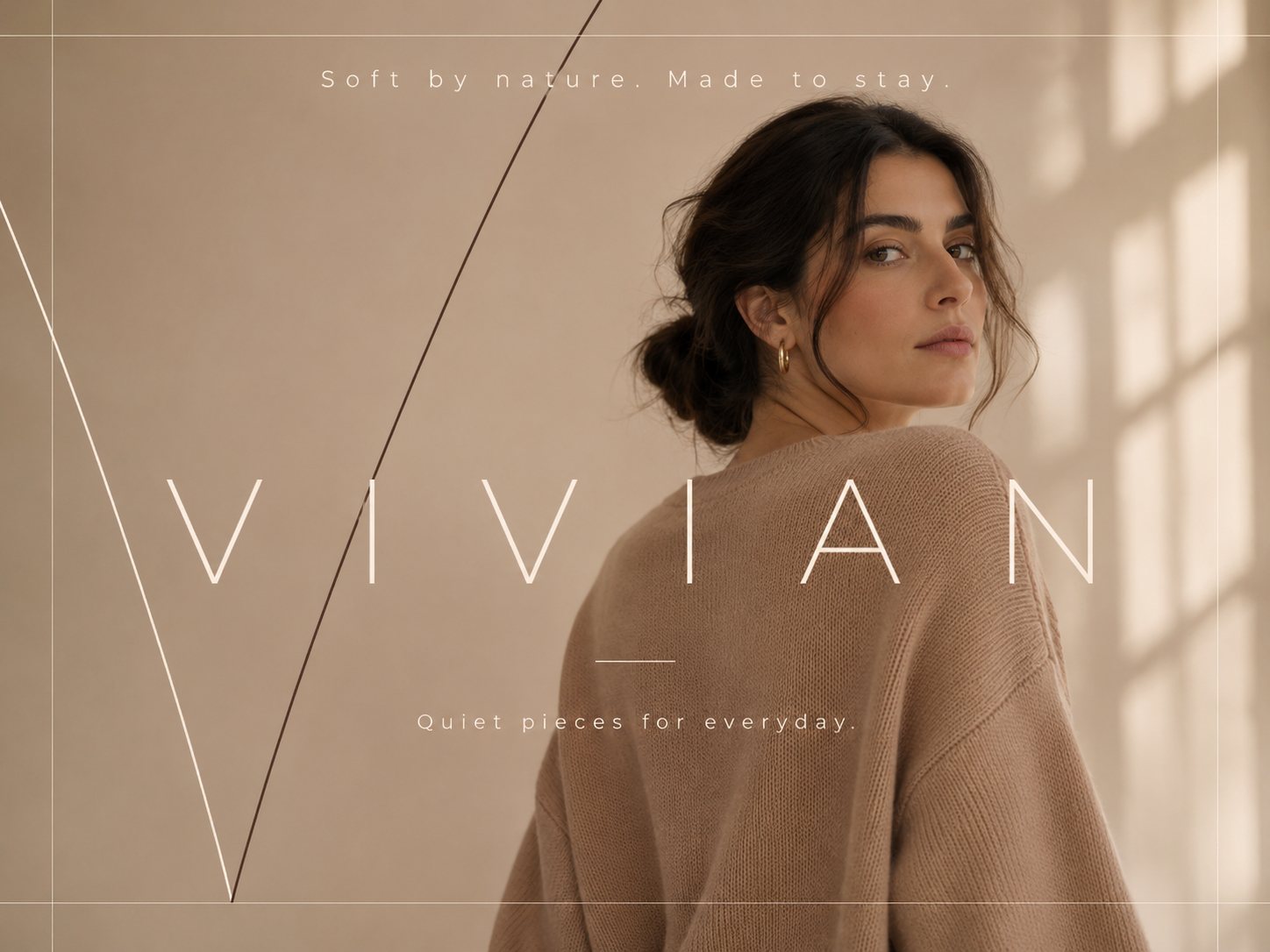
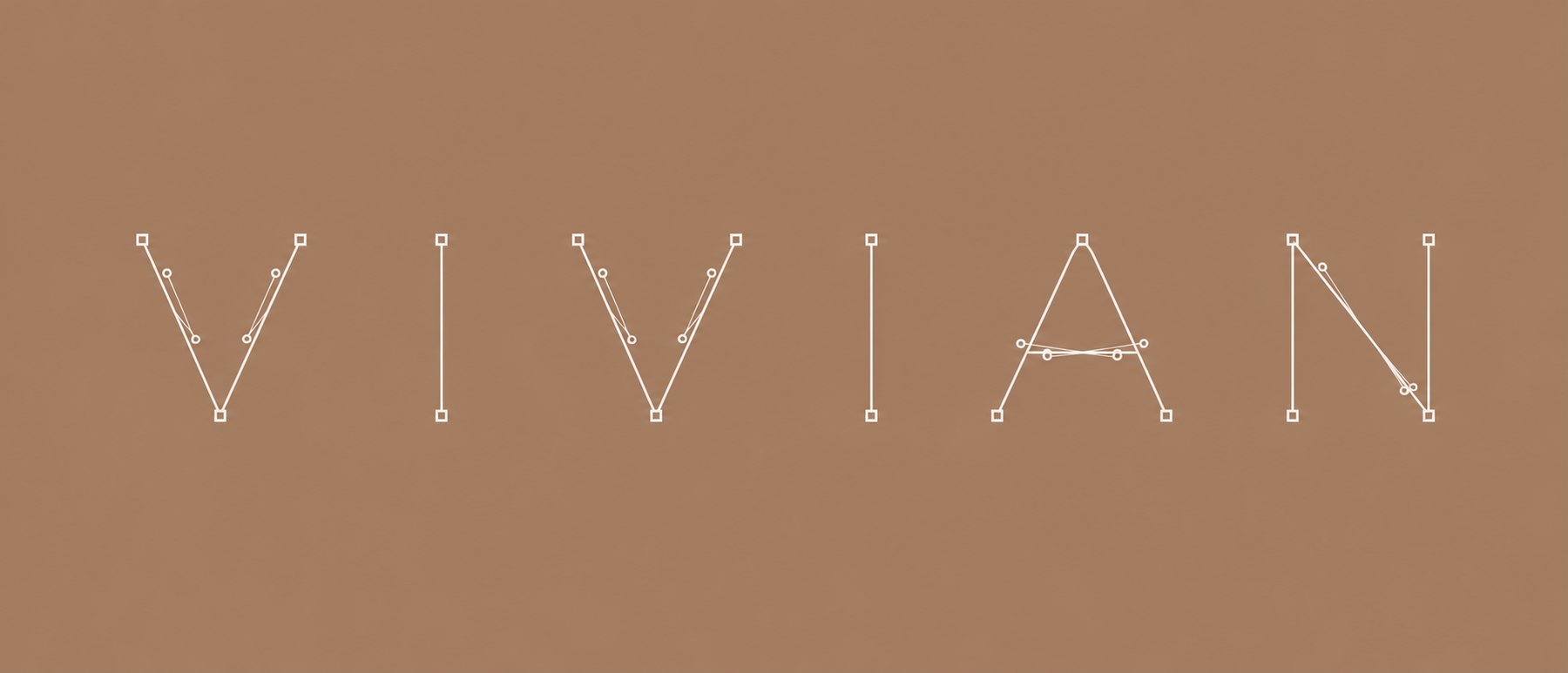
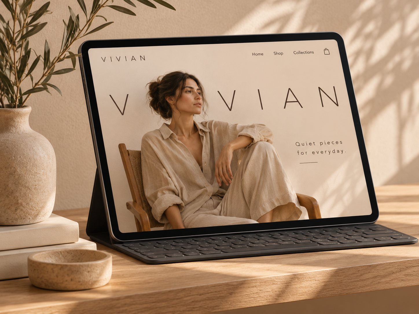
Thin capitals with generous letter spacing let the name breathe. Sharp V points give an otherwise soft system a quiet edge.
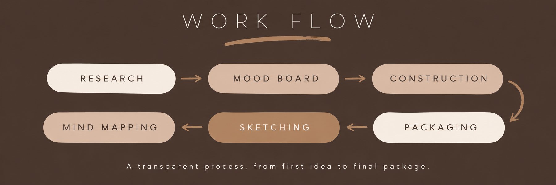
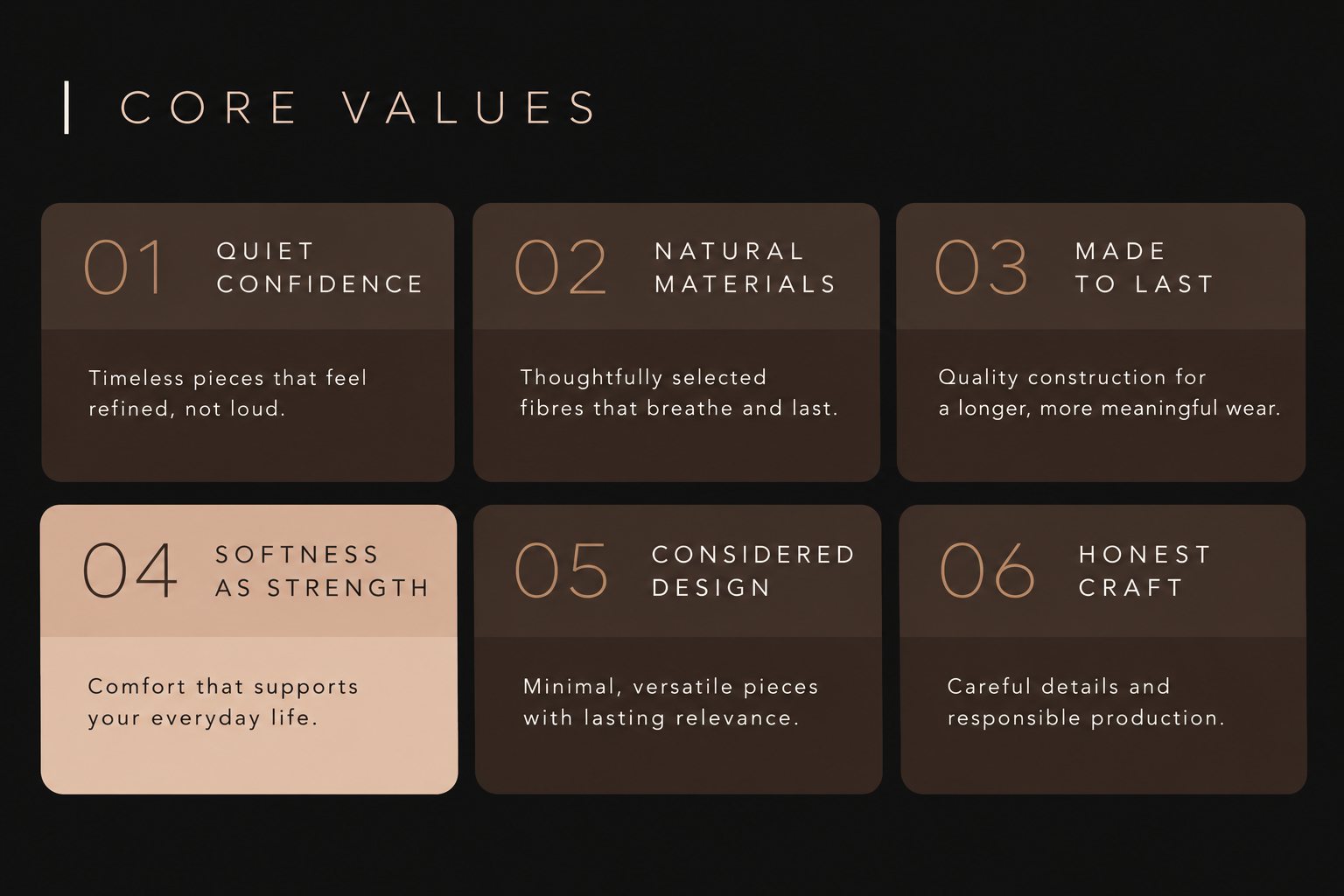
From research to packaging, every step was shaped around four pillars: Soft, Natural, Lasting and Quiet.
Slow fashion, natural textiles and soft architecture set the direction and the four brand pillars.
Washed linen, lime plaster, travertine and morning light, collected into one calm, warm world.
A light, open wordmark, a nude palette and simple rules that carry across every touchpoint.
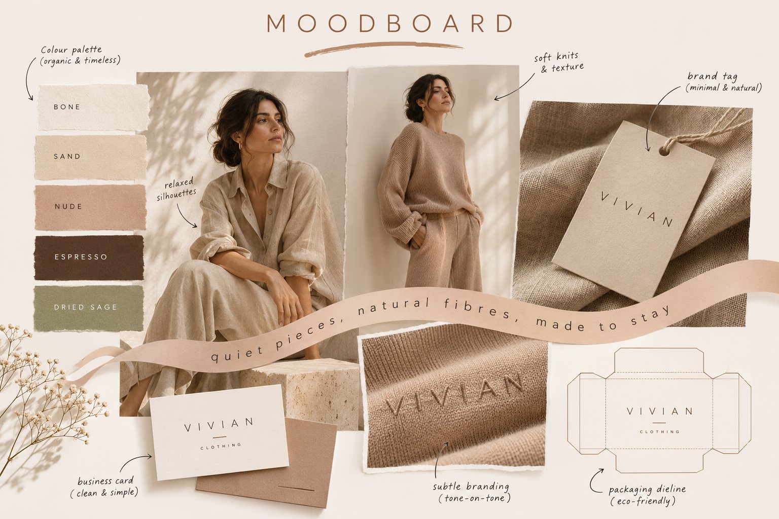
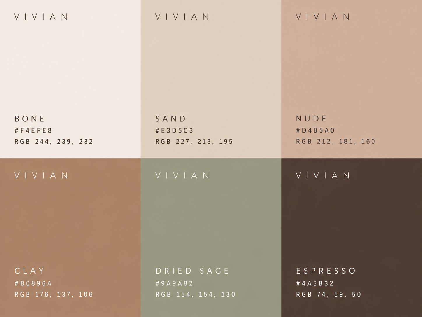
A nude, organic palette drawn from skin, linen and stone. Bone leads; espresso and ink keep it grounded.
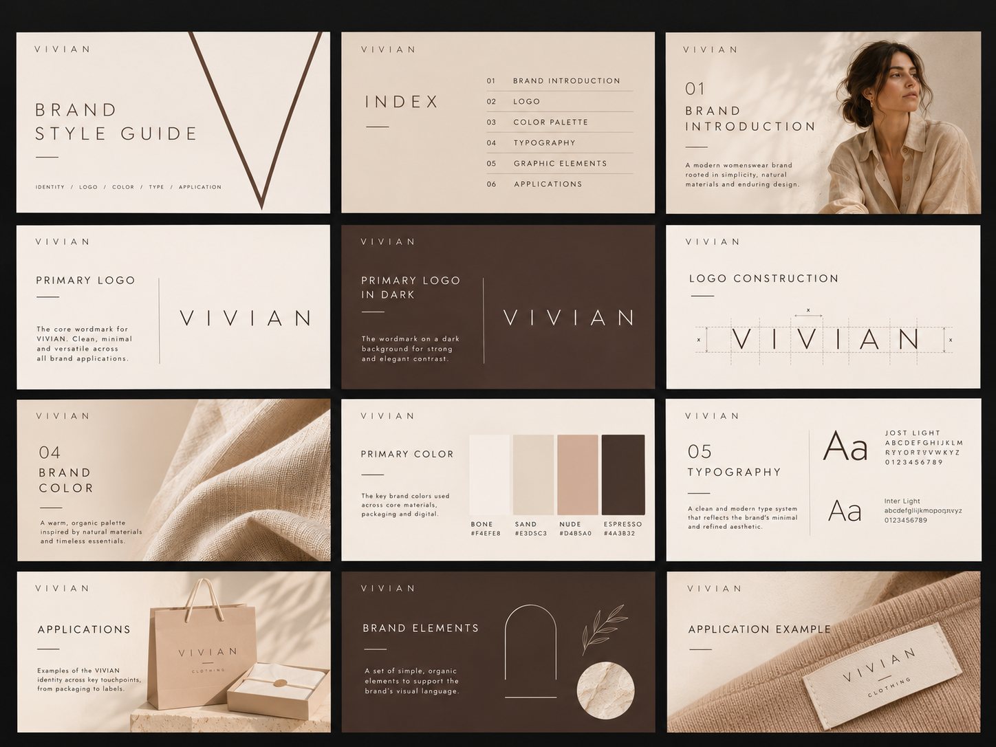
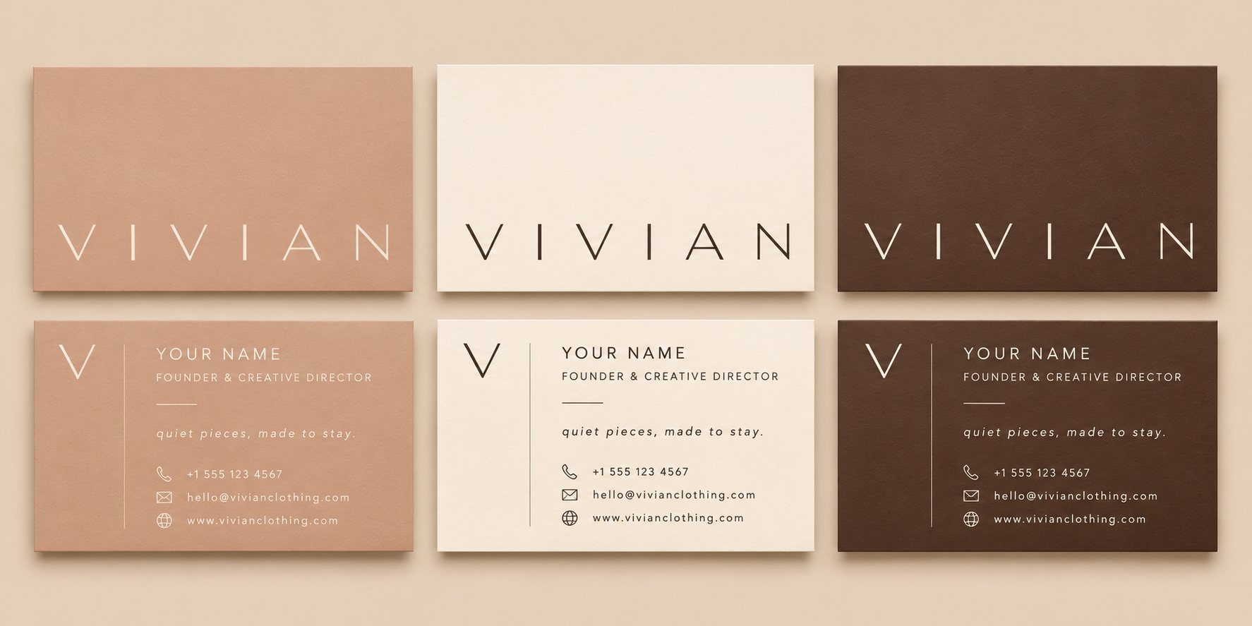
Every touchpoint follows the same quiet rules: nude grounds, open space and a single wordmark.
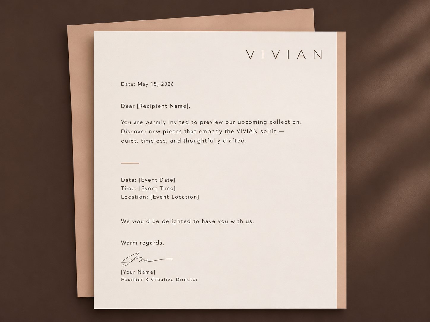
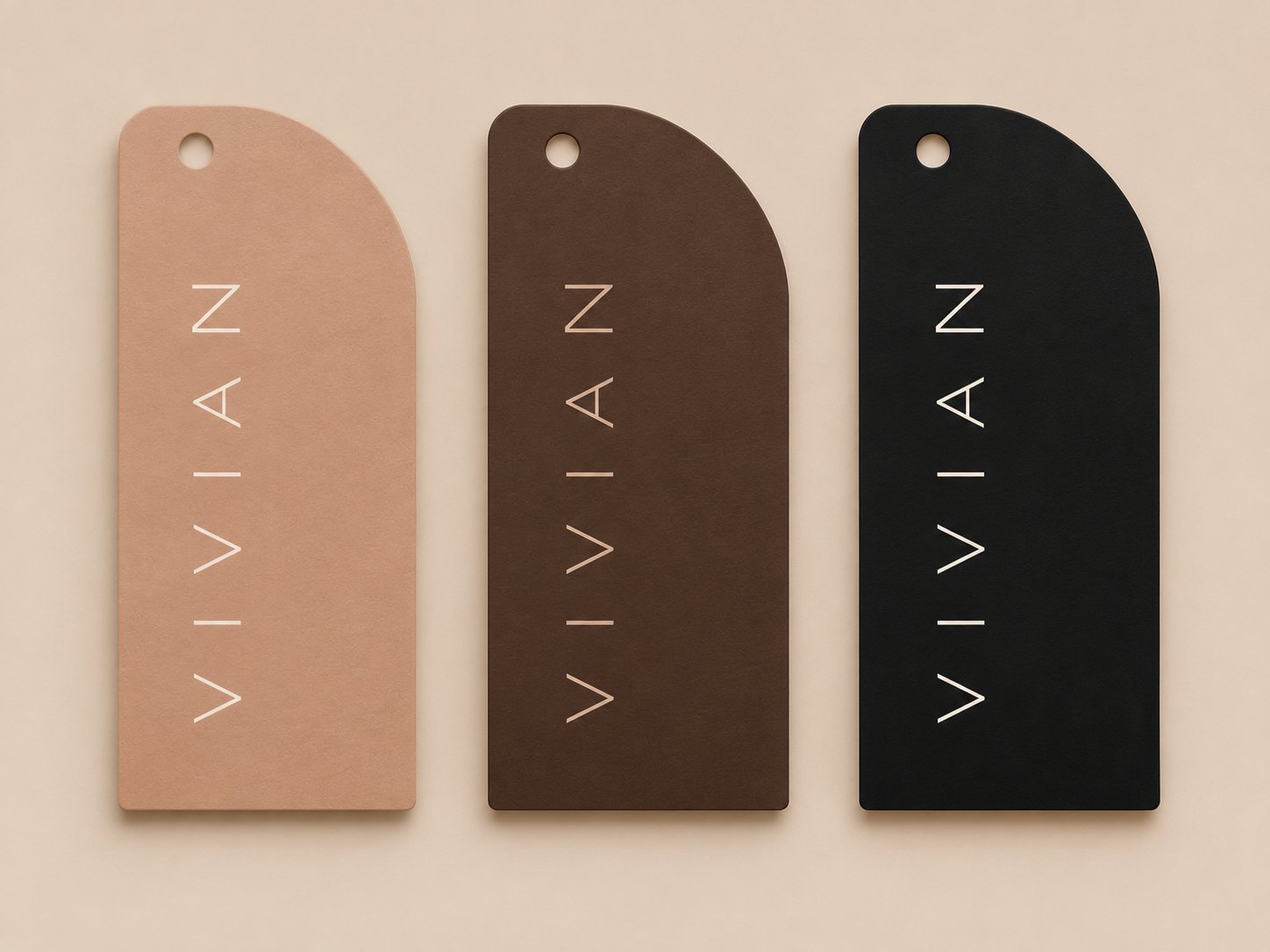
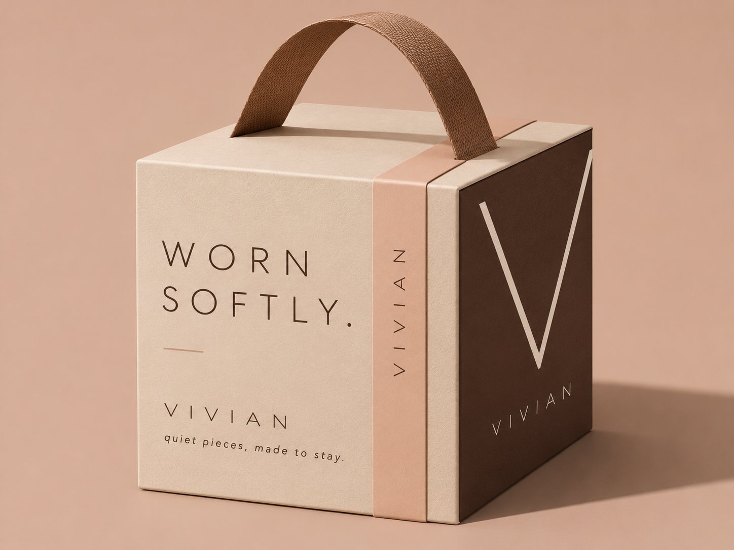
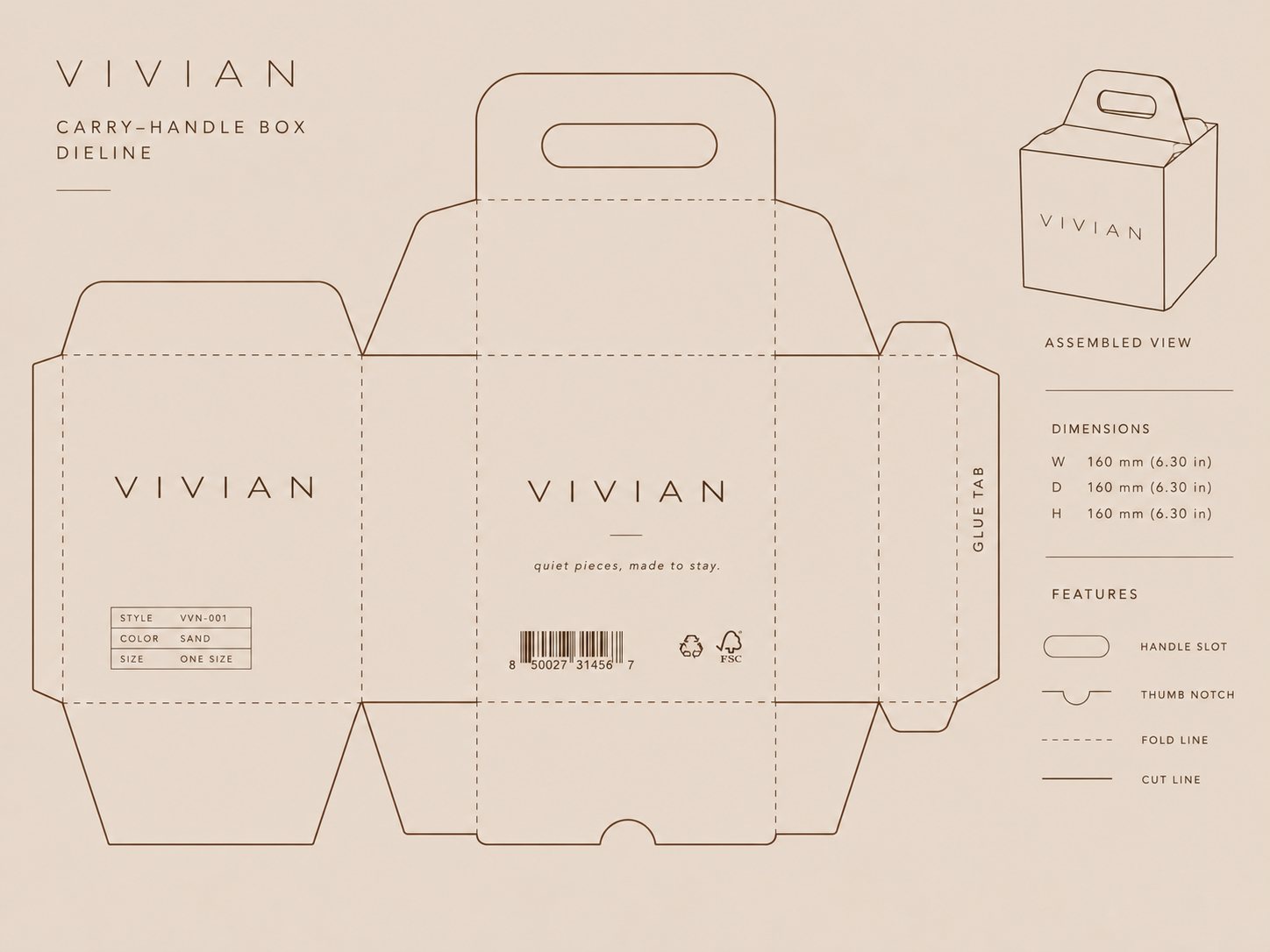
"Soft by nature. Made to stay." carries the brand from apparel to print and large-format screens.