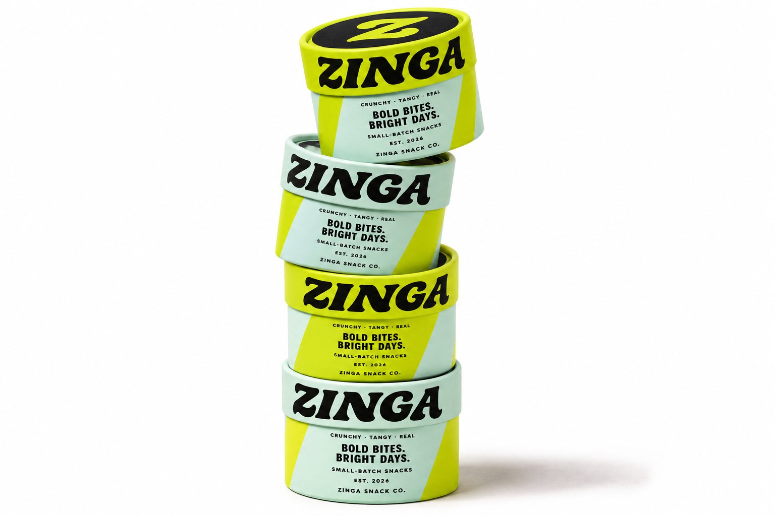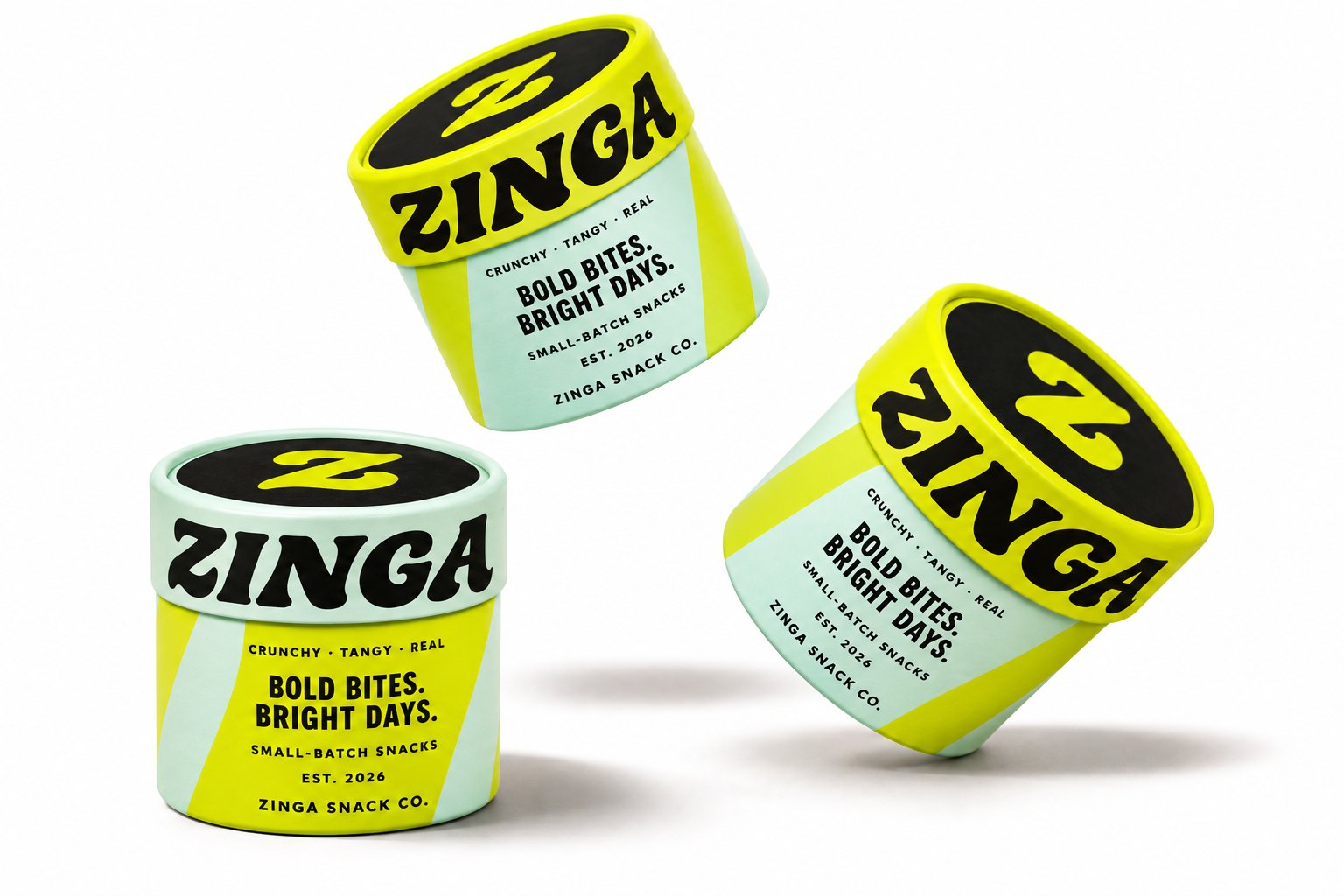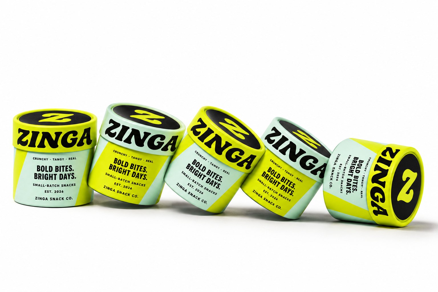
Bold bites. Bright days.
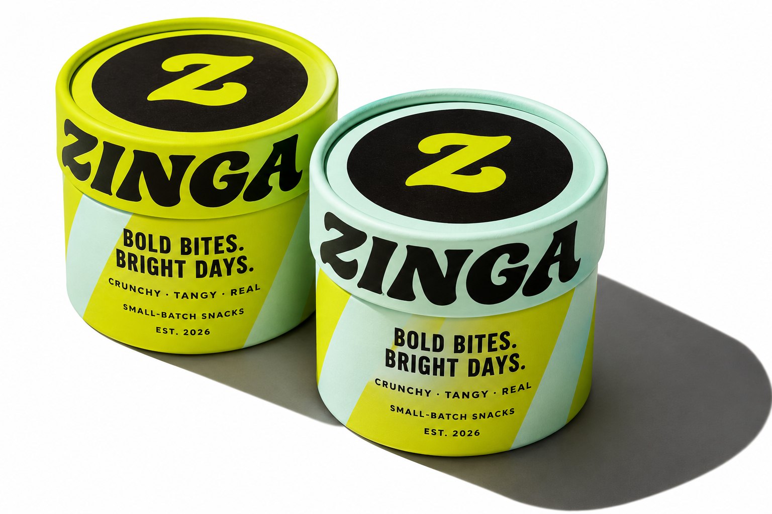
ZINGA is a concept identity for a small-batch snack brand: a name, a logo and a paper-tube packaging system built to feel playful, loud and fresh on the shelf.
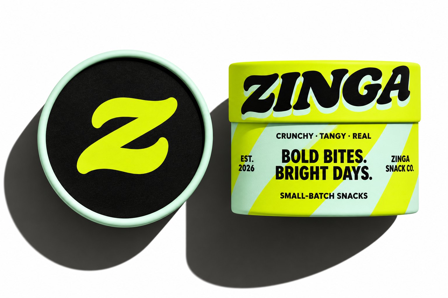
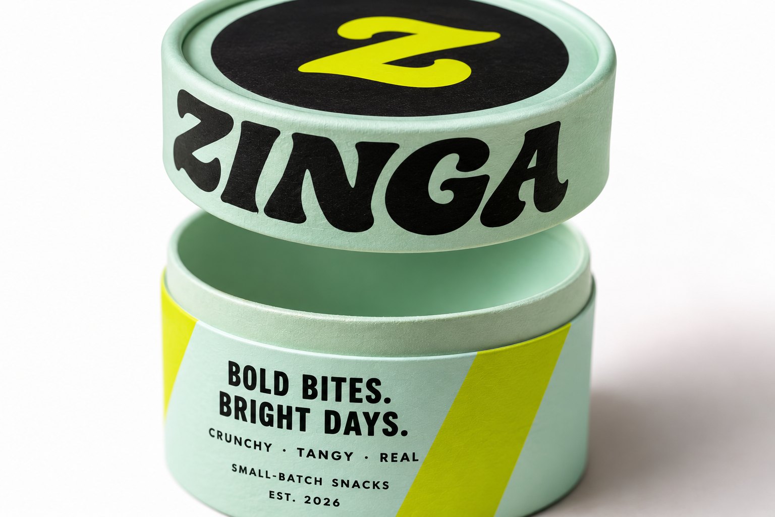
The project started from a packaging reference of short paper tins with oversized type wrapping around the lid. I kept that structure and gave it a food personality. The name ZINGA suggests zing and a little kick of flavor, and the wordmark is set in a swashy retro display face with a solid mint drop shadow, tilted upward so it reads like a sticker slapped on the lid.
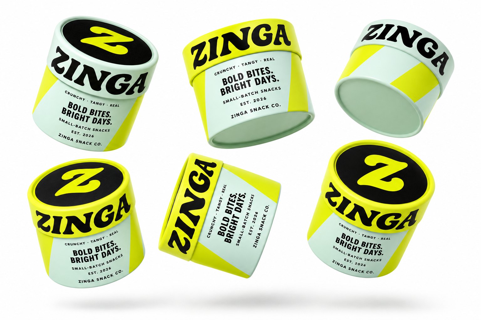
Acid lime and cool ice mint carry the system, with black for type and the round "Z" badge on every lid. Wide slanted color bands wrap each tin, so a stack of mixed lime and mint tins reads as one brand.
A swashy, tilted wordmark with a mint offset shadow, plus a round Z badge for lids, stickers and small sizes.
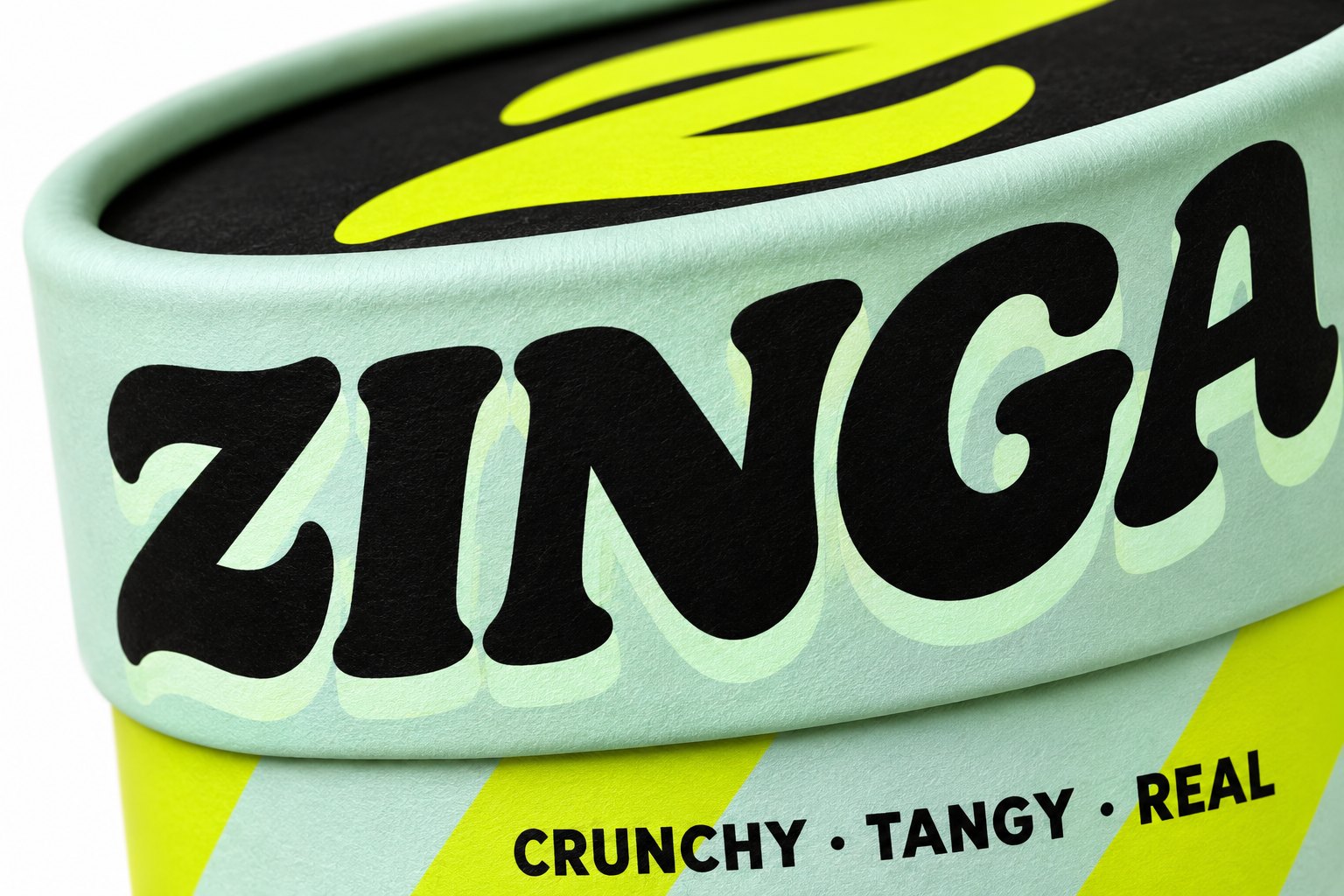
A retro display script for the brand voice, paired with a condensed sans for labels and claims.
Acid lime leads, cool ice mint balances it, and black keeps every message sharp.
Short paper tins with telescoping lids. The wordmark wraps the lid band, the Z badge sits on top, and wide slanted bands alternate lime and mint.